Microinteractions: Small Ways to Improve User Experience

Your website needs to be engaging.
In fact, a visually interesting site is almost equally important as it being usable. When a user comes to your site, the goal is for them to find the information they’re looking for and also to want to engage further.
Adding interactive elements is one of the best ways to encourage a more engaging user experience, and that’s where microinteractions come into play. A microinteraction, according to the Nielsen Norman Group, is a tool used to “convey system status, support error prevention, and communicate brand”.
These small elements are designed to provide immediate feedback to users, helping them understand what to do next, how to fix an error, or how long a process may take.
Curious what these microinteractions look like in practice? Let’s look at some examples.
Hover Effects

https://www.allbirds.com/
Hover effects are one of the most basic building blocks of interactivity.
They take a page from static to lively and provide visual cues to users. A hover effect communicates that something is clickable and will lead to more information. We see this most often with text links, buttons, carousels, and content tiles.
Tooltips
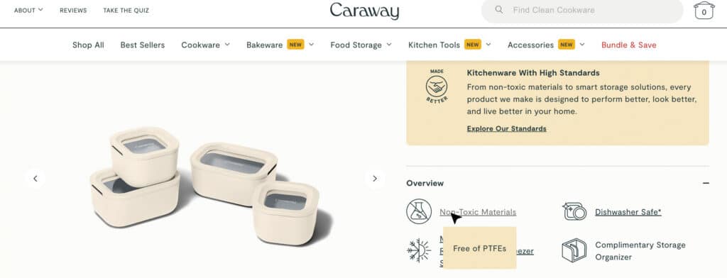
https://www.carawayhome.com/
Similar to a hover effect, a tooltip appears when a cursor is held over a certain area of the page.
Instead of the area changing visually, a small pop-up appears with text. Often used during onboarding processes, a tooltip can offer additional information without the user having to click or scroll to a new area.
Progress Bars
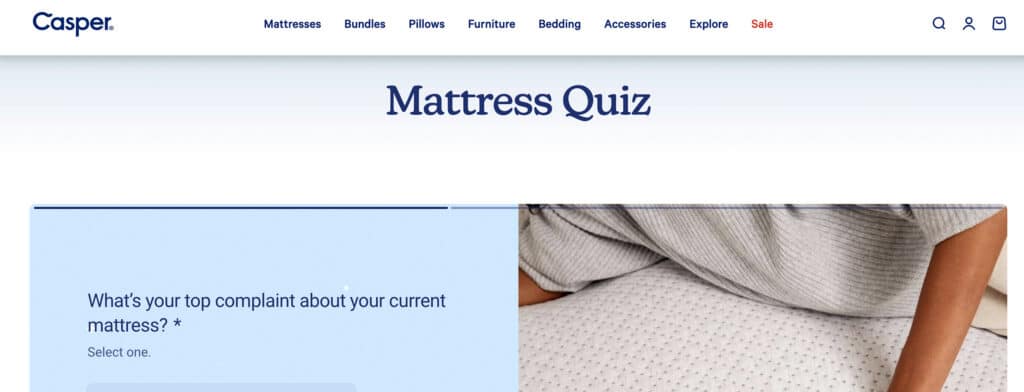
https://casper.com/
When completing a multi-step process (like filling out long forms), a progress bar can help provide context and set expectations for users.
A progress bar may show what percentage of the process is complete or describe how many total steps there are. This gives users a clear understanding of how long the process is going to take – and increases satisfaction once completed.
Loading Animations (and Success/Error Messaging)

https://www.warbyparker.com/
When you fill out a form or select from a set of filters, a loading animation provides visual confirmation that your submission is in progress.
It helps keep the site interaction joyful, rather than unclear, as users wait to see the results. Including some type of success (or error) messaging at the end signifies the process has been completed. In the example above, a button appears when your quiz results are ready to view.
Table of Contents
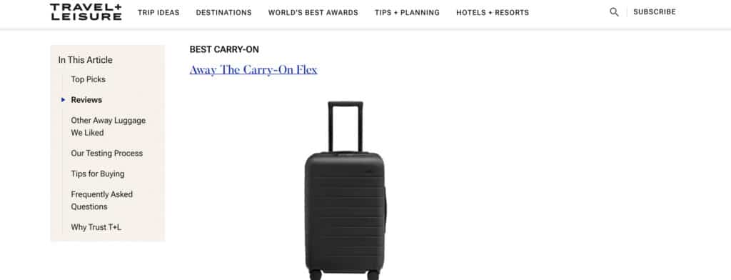
https://www.travelandleisure.com/
A sticky table of contents can follow users through a page, giving a visual indication of their progress and allowing them to jump to other sections quickly. This gives users an idea of how long reading the page might take and gives them immediate control over their experience. Providing users with this type of control of the user experience improves overall satisfaction.
As always, being thoughtful about how you implement these elements is important. Microinteractions should serve to make the website experience easier and more enjoyable – not overwhelming or confusing.
If you need help adding some microinteractions to your site, we can help – reach out to us.