17 Ways to Make Your Website More Interactive

Interactive.
It’s a word we hear often from our partners planning a website redesign, and we’ve heard it more and more lately.
No one wants their website to be boring, and nowadays, “boring” tends to mean static, lifeless websites.
We have the imagination to be as creative as we want with our website designs, and now we also have the web standards and technology to bring them to life.
If you’re considering ways to make your website more interactive, here are 17 examples to consider – most pulled from our own partners’ websites.
Add Interactivity to Your Website
1. Fade in Background Images
The effect of seeing a background image fade in to frame – especially when it happens as you scroll to that section of the page – provides depth and can be part of a nice layering effect.
2. Load Images in Sequence
If you have a set of related images or icons, try loading them sequentially using an animation delay.
![]()
3. Slide Down Sticky Menus
Many websites use a sticky nav to keep the main menu accessible as the user scrolls down the page.
Rather than simply make the menu “jump” to the top of the page or stay fixed as you scroll, consider having the menu slide down from above the page and rest at the top of the browser. You can also make your interactive sticky menu change color, size, and more.
4. Slide Up Titles
Consider having your page title or section headers slide from a slightly lower position up to their final resting spot. If it’s your section headers, make it happen as the user scrolls to that section of the website.
The juxtaposition of the user scrolling down while the headers slide up makes it feel like the page is moving.
5. Move Items Up on Hover
It’s difficult to make static images feel like they’re moving, so the best way to add a bit of interaction is to add a hover effect.
Consider tweaking the image so that, when you hover over it with your mouse, it moves up a few pixels (and then moves back down when you take your mouse off of it).
6. Slide In Call-to-Action
If you have a specific promotion – like subscribe to our newsletter, follow us on social media, etc. – consider creating an animated call-to-action that slides from the outside of the browser, sideways into the frame.
Since most websites require scrolling down, you’ll have an interesting experience where the content moves from right-to-left or left-to-right.
Want to see this action? Visit another page on our site and scroll about half way down the page – and then subscribe to our newsletter.
7. Change Border Colors
This animation works great on photos and elements with a unique shape.
Hover over the object, and the border can appear, change colors, change sizes, or all of the above.

8. Change Icon Colors
We use this often with social media icons; when you hover over the icon, change its color. In addition to making it interactive, it lets the user know that there’s an action they can take (clicking) with that icon.
9. Layer Animations
The interactivity and animations you use don’t need to exist on their own. Try layering animations, such as fading in content and sliding it up, for multi-layered movement.
If you want to get fancy, tie in your text animations with background animations, like we’ve done on the homepage of our site.

10. Use Videos and GIFs Appropriately
A large, full-screen video on your website’s homepage can be a great way to position your organization and help tell your story.
Similarly, using animated GIFs can help bring movement to otherwise static imagery.
You do have to be careful; your video shouldn’t autoplay sound and your GIFs should be used appropriately. Both videos and GIFs can become annoying if they’re overused or prevent your audience from taking action.
11. Use Loading Graphics When Necessary
Most loading graphics are simple GIFs, but they have a purpose: to let the user know that something is happening.
If your website needs time to load, or has a function that happens behind the scenes that takes a few seconds, use a loading graphic. It’s an easy way to tell the user that everything is fine – just to hang tight until we’re ready to go.
12. Change Button Colors on Hover
This is another easy and helpful way to show your users they can take action.
Have your buttons change background color when you hover over them; you may even put a slight transition delay on the color change so it happens more organically.
13. Expand Search Bar on Click
Rather than displaying an entire search bar, consider hiding the input box behind a magnifying glass icon and having it expand when clicked.
Not only does this add interactivity, it also helps when you’re dealing with a large main menu and need to use every pixel intentionally.
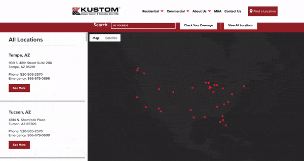
14. Create Interactive Google Maps
Adding interactive Google Maps to your website can provide a new way to show your location-based content and give your user additional ways to interact with your site.
We’ve done everything from plotting business locations to neighborhood maps to upcoming events on Google Maps using Advanced Custom Fields and Simple Locator.
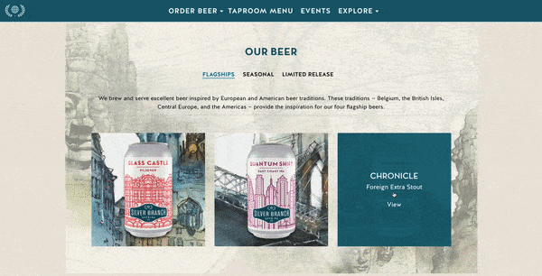
15. Display Text Over Images on Hover
If you have a lot of images with accompanying text, this can be a creative way to show your content without having to create incredibly long pages.
For our partners at Silver Branch Brewing Company, we display each beer’s information on top of a picture of the actual can or label – making it easy to associate the text with the corresponding image.
16. Use Expanders to Show Hidden Content
Expanders are a feature where you click an icon to reveal content that was otherwise hidden by default. Expanders help you include lengthy content on a page without worrying about the actual length of the page.
Many of the sites we design use this functionality, whether it’s for something like an FAQ page or more details about a product or program.
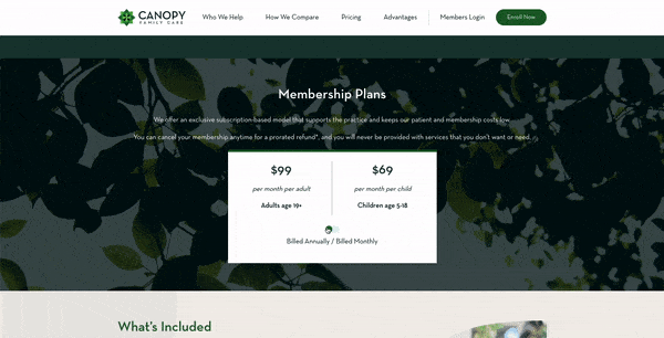
17. Add Toggles to Change Content
This is commonly seen on “Pricing” pages; it gives the user the ability to click between multiple options and see their results.
We use this on the landing page for Canopy Family Care; potential patients can choose their family size and see their pricing options.
While many of these features are subtle, they’re certainly worth the effort to include. It’s important to strike a balance when adding interactivity to your website, lest your site become overly-complicated and messy.
Layering simple touches to create a more dynamic experience will achieve the ultimate goal of a website – keeping users engaged with your content.