Gravity Forms: 5 Useful Tips and Tricks

Many websites benefit from using forms to capture data and information from their users, such as a simple contact form.
There are many options for building out forms on WordPress sites, including third-party form software such as Jotform or Google Forms. Our recommended form plugin for WordPress is Gravity Forms because it is easy to use, customizable, and offers robust form building capabilities.
For most websites, building out simple forms with a few fields (Ex. Name, Email, Company) gets the job done.
But if you’re someone looking to dig more into Gravity Forms and build out better, integrated, and more user-friendly forms, here are 5 tips and tricks you should know.
1) Multi-Page Forms
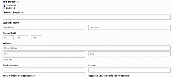
Have you ever created or encountered a form that felt like it was a mile long?
When a user sees a super long form, there’s an increased chance that they’ll bounce rather than taking the time to fill it out. Long forms are not only annoying to navigate — they are also visually intimidating.
While it’s always better to limit fields to important information, there are times where it’s unavoidable and you need to capture a lot of data, such as for event registration, scholarship applications, etc. In this case, we recommend creating a multi-page form.
Multi-page forms allow you to have reduced height in your form, thereby making the form more approachable. It also gives you the option of including a Progress Bar, which increases transparency to the user about how much is left and provides subconscious positive encouragement when they progress through the form.
Learn how to create a multi-page form here.
2) Animated Transitions
The ability to animate transitions in a form, such as revealing conditional fields, adds a level of polish to the user experience and is super easy to implement.
After creating your form, go to the Form Settings, scroll all the way down to Form Options, and toggle on “Animated transitions.”
BONUS TIP: While you’re in the Form Options section, we also recommend enabling “Anti-spam honeypot” to reduce the number of spammy bots that bombard your form entries.
As I mentioned in a past blog:
Forms that are open to the public will inevitably get spammed. There are many ways to reduce spam, such as by including anti-spam honeypots. Honeypots are traps that are designed to identify spam bots. The honeypot is a hidden field that only bots can see and interact with, so there is no impact on user experience.
3) Popup Forms with Popup Maker
An alternative solution to reducing visual clutter with long or chunky forms is by displaying the form as a popup through a button. In order to do so, we recommend using another plugin called Popup Maker which makes it easy to create Gravity Form popups.
Another helpful application of Popup Maker is creating a newsletter signup. The popup could include a very simple newsletter signup form with a few fields, and can even be set to have a cookie preventing it from opening too frequently (to avoid annoying your users).
Learn how to create a popup with Popup Maker.
4) Integration with CRM
At the top of this blog, I mentioned that forms are often used to capture data from visiting users. Perhaps you’re collecting newsletter subscribers, event registrants, or potential clients/partners.
While a simple form collecting this information does fulfill the purpose of receiving information to a repository, it doesn’t (and shouldn’t) end there.
The data you collect should funnel into your wider Customer Relationship Management (CRM) software or mailing list so that you can continue engaging users even after the initial event or exchange of information ends. Gravity Forms offers seamless integration with various CRM and email providers such as HubSpot, Constant Contact, Mailchimp, and more.
This integration will often require an Add-On or additional plugin, but typically are very straightforward to set up.
5) Placeholder Text
When adding a Drop Down field to your form, by default Gravity Forms will display the first option as the placeholder text in the drop down menu. While I understand the logic, this default text can be confusing to a user and make it appear that they have already selected an option.
To avoid this potential confusion, navigate to the Field Settings and then Appearance. The first option you’ll see is “Placeholder,” which is where you can write in your own message such as “Select Option.”
Crisis averted!
If you need help leveling up your Gravity Form game, reach out! That’s what we’re here for.