Visual Hierarchy: How to Guide the Eye

Have you ever stared at a graphic or website and felt like you didn’t know where to look? That’s usually because of a lack of visual hierarchy.
Good design goes beyond how something looks – it’s also about how it flows. Visual hierarchy is what guides your eye through the content, showing them what matters most and what to look at next.
Let’s break down what exactly visual hierarchy is and how to use it to your advantage.
What is Visual Hierarchy?
Visual hierarchy is the order that your eyes process what they’re seeing.
In simple terms, it answers the question: what do I look at first? From there, the eye moves naturally to the next most important element, and then the next.
This is important because, if everything looks the same, nothing stands out. Nowadays, people don’t read content word for word, they scan – so if your design doesn’t guide them naturally, they’ll either miss key information or move on entirely.
Strong visual hierarchy makes your content easier to understand, quicker to read, and more effective overall.
Creating Hierarchy with Typography
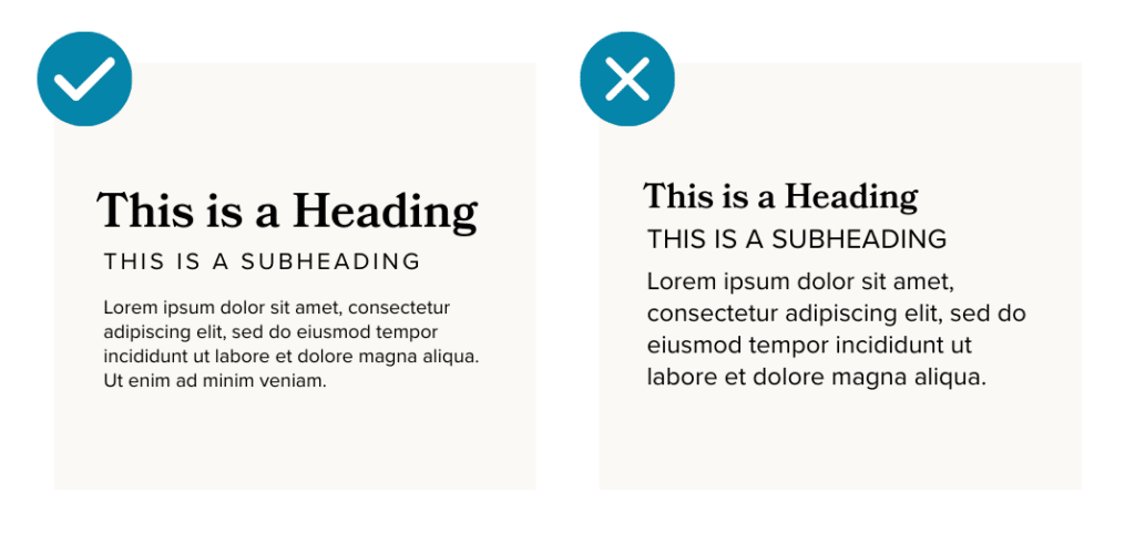
Text is one of the easiest ways to establish hierarchy.
Your headline should be the most prominent element, grabbing attention before anything else. From there, subheadings and body text should clearly step down in size and weight (this also helps to ensure legibility).
If everything is the same size, your eyes have no direction. But when there’s clear contrast, content becomes much easier to follow.
Creating Hierarchy with Color

Color usage is another powerful way to visually guide the eye.
High contrast colors naturally draw attention, so they should be used to highlight what’s important. For example, calls to action, buttons, links, and key messages should use a dedicated color to stand out prominently against the rest of your content.
Using color intentionally helps highlight what matters most without adding unnecessary clutter.
Creating Hierarchy with Layout

This is another critical use case of visual hierarchy.
Spacing, alignment, and placement all play a role in how your content is experienced. For example, elements grouped together will feel related, while those with more white space around them feel more important.
A cluttered layout makes everything compete for attention. A clean layout creates a clear path for the eye to follow.
4 Quick Tips for a Clear Visual Hierarchy
If you’re working on implementing a clear visual hierarchy in your graphics or website, here are our top tips to keep in mind:
- Start by deciding what matters most. Every design should have one clear focal point.
- Use size to your advantage. Larger elements naturally draw the eye first, so your most important message should be the most prominent.
- Create contrast. Whether it’s through color, weight, or spacing, contrast helps separate what’s most important.
- When in doubt, keep it simple. The clearer your layout, the easier it is to follow.
Visual hierarchy directly impacts how people understand and interact with your content. Without it, your message can easily get lost and your audience may miss what matters most.
If your content ever feels cluttered or overwhelming, there’s a good chance your hierarchy needs a second look.
Need some guidance? Reach out to us — that’s what we’re here for.