Color 101: How To Actually Use Your Color Palette
Color plays an important role in visual design, and is an essential component of any brand strategy. We know that color contributes to creating an emotional connection with your audience, in addition to establishing the overall look and feel.
So, how do you ensure your color palette will work to effectively tell your story?
It’s not as simple as choosing a set of cohesive colors and calling it a day. You need to be intentional with when and how each color gets used.
Here are some tips to get you started.
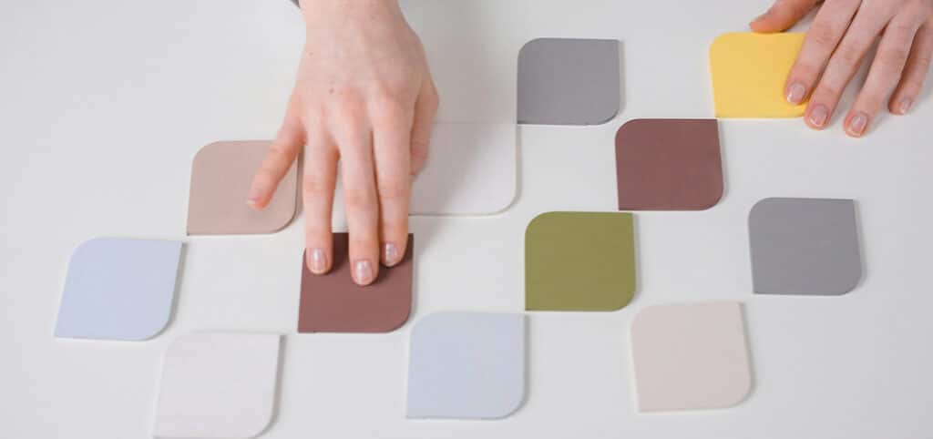
Get creative with your neutrals

One way to instantly make a palette feel more elevated is to get creative with your neutrals.
By default, most palettes include black and white, typically used for text. Implementing a cream or off-white color instead can create a clean look that’s not so sterile. (Hint: This is the perfect way to incorporate something like Pantone’s Color of the Year: Cloud Dancer).
As part of a complete palette, an off-white shade creates an accent that is perfect for text on darker backgrounds – or it can serve as a subtle background color itself. Stepping away from standard neutral colors increases visual interest and makes the design feel more thoughtful.
Create guidelines (and follow them)
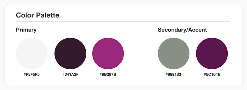
Most color palettes range from 3-5 colors, and many times we will break those down into ‘primary’ and ‘secondary’ palettes. From a brand perspective, it’s important to establish guidelines on how each color is used.
For example, you might indicate that on your website, primary colors will be used for text, buttons, and navigation – and secondary colors will be reserved for accents such as background colors or design elements.
Whatever you decide, having a clear set of guidelines will help with consistency throughout different projects and build brand recognition.
Make calls-to-action stand out

Buttons serve as important calls to action throughout any website, so they need to stand out against other content.
To achieve this, you’ll want to select a color from your primary palette that isn’t already being used for other design elements. In the example above, the vibrant magenta button draws your attention immediately – despite the presence of imagery and other design elements.
It’s usually helpful to have at least one alternate button color for use on different background colors. As with any color components, be sure to check the color contrast ratio to ensure the combination is accessible for all users.
Build in microinteractions
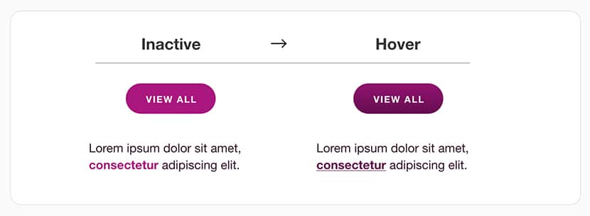
Microinteractions are the elements of interactivity built into websites and apps – things like hover effects, animations, and parallax scrolling.
They help to create engagement and make the user experience more joyful. When it comes to hover effects, color is instrumental. When a user moves their cursor and sees a component change color, they understand that it is a clickable element leading to a new page.
The color change should be noticeable without becoming distracting, as shown in the example above.
Keep it simple
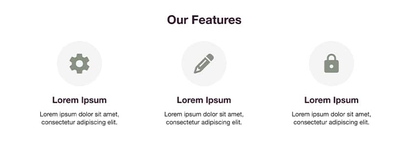
If you’ve created an extensive color palette, it can be tempting to use each and every hue – but doing so is just not effective.
Instead, consider a simplified palette and use tints and shades of existing colors to incorporate variety without becoming overwhelming. When you stick to a smaller, consistent color scheme, splashes of color are much more effective at calling the users attention to important areas of the page.
When applied correctly, a color palette enhances the user experience, building brand recognition and loyalty. Taking the time to be thoughtful about use of color will help set your brand apart. Still have questions? We can help.