Above the Fold: Make Your First Impression Count

Being above the fold still matters.
It’s not just a leftover phrase from the days of morning newspapers. On websites, the fold refers to what a user sees before they start scrolling.
Just like it was prime real estate in print, being above the fold is prime real estate on your website – and can make or break your user experience.
Here’s what to include and what to avoid above the fold.
Why Does Being Above the Fold Matter?
When someone lands on your website, they’re making a decision about what to do next almost immediately.
In just a few seconds, they’re asking themselves:
- Is this meant for me?
- Do I understand (or care) what this is?
- Do I want to keep going?
That’s what above the fold content is for.
This is not the place to showcase everything you offer. This is the place to give users enough clarity and direction to decide if they want to move forward through your site.
If they have to think too hard or search for answers, they’re more likely to bounce.
What to Include Above the Fold
There are a few key components that make this section effective. Let’s take a look at this example from Trello and break it down.

https://trello.com/
The same components also make for an effective mobile experience:
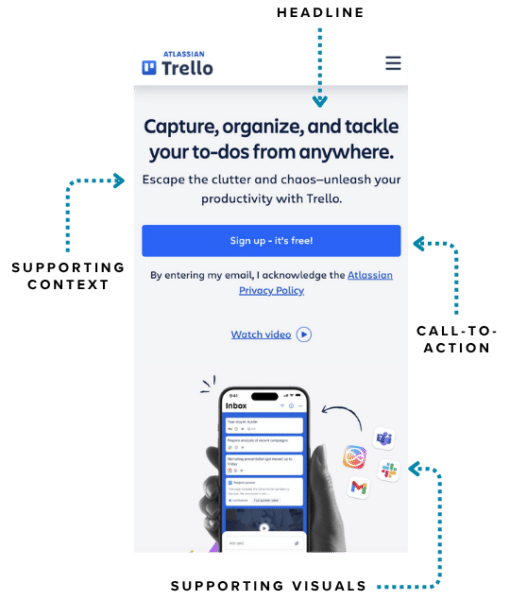
A Headline
Your headline is the star of the show. A clear headline should grab attention and quickly communicate what you do and who it’s for.
If someone can’t understand what your website is about within a few seconds, your headline likely isn’t clear enough. The goal is to be as direct as possible.
Supporting Context
After your headline, include a short sentence that further explains the value or outcome of working with your organization.
This reinforces your message and gives users a reason to keep reading.
Call-to-Action
Once your users have an understanding of what you do and who you serve, you’ll want to guide them toward their next step with an effective call-to-action.
This should typically be the primary goal of your website; for example, to “Get Started,” “Contact Us,” or “Donate.”
It’s usually fine to include a secondary call-to-action when necessary, but you’ll typically want to highlight one of them more prominently.
Supporting Visuals
Include a high quality, on-brand visual that helps to reinforce your message.
This could be an image, graphic, or even a video. Regardless of the format, it should add clarity and help tell the story.
What to Avoid Using Above the Fold
Above the fold is where users decide whether to stay or leave, and small mistakes can have a big impact.
Now imagine if Trello, using the example above, made some mistakes of their own. Their site might look something like this:

While this example is hypothetical, these are common mistakes seen in real-world websites.
3 Tips for Impactful Above-the-Fold Content
So how do you avoid these mistakes? Start with these three tips:
- Be Concise: When too much is packed into this space, it becomes overwhelming. Instead of naturally guiding users to take action, it confuses them.
- Use Clear Language: Unclear or generic messaging has a similar effect. If someone can’t quickly understand what you do, they’re not going to stick around long enough to figure it out.
- Create Hierarchy: A lack of visual hierarchy makes it difficult to understand what’s actually important. When everything is treated exactly the same, users are left without a clear direction.
At the end of the day, the important thing to remember is this: clarity creates momentum, confusion creates drop off.
If your website isn’t guiding users clearly from the start, let’s fix that. Reach out to us – we’re here to help!