Rebranding? Learn From These 5 Iconic Brand Makeovers

Feeling the itch to refresh your brand’s look and feel, but not sure where to start? Don’t worry, we’ve all been there. (Literally – here’s how we did ours!)
A good way to kickstart your rebranding journey is by checking out what competitors in your industry have done and how big-name companies have tackled their own makeovers.
Let’s take a look at some of the most iconic rebrands that we have seen and what they can teach us.
1. Dunkin’
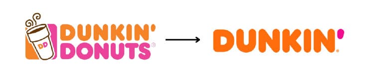
In 2019, Dunkin’ Donuts underwent a famous rebrand when they dropped the word ‘Donuts’ from their name. As a part of their rebranding efforts, they were able to modernize their brand and expand their offerings to appeal more to their target market.
They have since introduced a wide range of foods and beverages to their menu, helping to remain competitive against companies such as Starbucks and help establish them as a premier brand.
Key Takeaway: By understanding your target audience’s preferences and aligning them with the direction of your company, you can effectively modernize your brand and offerings to stay ahead in a competitive market.
2. Domino’s
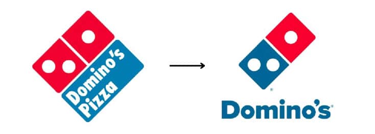
In 2012, the popular pizza chain Domino’s replaced their 15-year-old logo with a fresh visual identity, complete with a modernized color scheme, font, and logo.
This iconic rebranding effort also included an updated layout inside their stores, new packaging designs, and a bold ad campaign that emphasized their plan to improve the quality of their products. The combination of these things demonstrates their forward thinking and commitment to excellence.
Key Takeaway: A successful rebrand goes beyond just a logo. You should consider all components of your brand and how you can update them to align with your overarching goals and messaging.
3. Airbnb
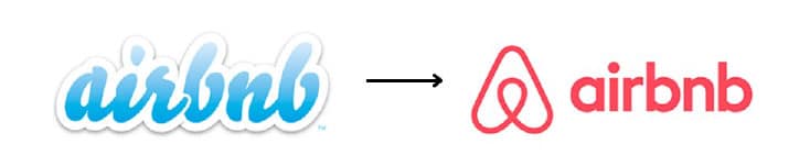
Unlike the previous examples who preserved some of their visual identity in their rebranding efforts, Airbnb took a much more drastic approach. In 2014, the company unveiled their new branding that featured a new look and emphasis on community and accessibility. (Here’s our review at the time.)
Since their founding in 2008, the company experienced exponential growth and felt they have outgrown their previous brand identity. As they evolved, they needed something that better reflected their trajectory and aligned with their slogan “Belong Anywhere.”
Key Takeaway: Understanding when it’s time to make a change is crucial. As your company grows, be vigilant in assessing if your current branding still resonates with your mission and business trajectory.
4. Instagram

The famous Instagram rebrand launched in 2016 and came complete with a custom typeface, a vibrant gradient, and a refined design. They also gave their app interface a fresh look, with an emphasis on community and user experience.
This update modernized their brand, as they moved on from their previous logo, which resembled a vintage Polaroid camera, and signified a new direction for the company, which was initially a simple app to snap and share photos with friends. With their new look, Instagram has established themselves as a leader in the social media realm and set themselves on a path of sustained growth.
Key Takeaway: Embrace change in your brand’s journey. When your initial vision evolves, don’t hesitate to make bold shifts. This ensures your brand stays relevant and competitive.
5. Burger King
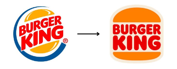
In 2021, Burger King changed their logo for the first time since 1999. The new branding is an adaptation of their 1969 logo with a simplified, nostalgic look and feel. This effort included new packaging, promotional materials, employee uniforms, TV commercials, and more.
This rebrand was all about the heart of Burger King: their food. Simplifying the logo was symbolic of their choice to simplify their ingredients by removing artificial colors, flavors, and preservatives. To improve the way people perceive their food, they started by refreshing their image.
Key Takeaway: When rebranding, don’t be afraid to reconnect with your brand’s origins. Going back to your roots can inspire a fresh perspective and help ensure that your visual identity and messaging authentically reflect your core values.
Remember that rebranding isn’t just about a new logo– it’s about reflecting who you are and where you’re going. Inspired by these iconic brands, it’s clear: change is inevitable, but it’s also exciting and holds a big impact on the future of your business.
If you’re ready to refresh your brand but need some guidance, don’t hesitate to reach out to us. We’re here to help you every step of the way!