Becoming Digital Ink: Examining Our Rebranding Process
As a designer and generally curious person, I always find it fascinating to learn about the process other designers and agencies take when they go through rebranding, so I thought it would be fun to talk about our own rebranding process and becoming Digital Ink.
Until January 1st of 2016, Digital Ink was known as Junger Media, and had been ever since Jason Unger founded it in 2008. At its inception and for several years after, Junger was the owner and only employee of a side business that primarily managed and launched WordPress-powered websites. So it made sense that the business’ branding should be built around Junger.
When I joined the company in 2013, we were still called Junger Media. My addition not only brought graphic design services, but it also meant that the business was no longer a one person company.
Becoming a larger agency wasn’t the only reason we needed to go through rebranding. On a seemingly daily basis, we encountered customers who pronounced our name incorrectly as “Younger” Media. I always found this very surprising, as my assumption was that most people would pronounce “Junger” with the hard “J” sound. I suppose more people than I thought are fans of Swiss psychiatrist and psychotherapist Carl Jung.
![]() It was a great lesson for me as a designer, as it reinforced that people may not interpret your work how you assume they will.
It was a great lesson for me as a designer, as it reinforced that people may not interpret your work how you assume they will.
There was also the issue of what our name told people about what we do. The term media has different meanings for different people and encompasses many different mediums and contexts.
For example, we would frequently be asked if we shot commercials or did video and audio editing. While we have occasionally done some video editing and production work and may do more in the future as we continue to grow, it wasn’t a core part of our business identity.
Essentially, the name Junger Media was failing to communicate our core as a growing creative agency.
Our Rebranding Goals
In early fall 2015, we set a deadline of January 1st, 2016 for the launch of our new identity. Ultimately, we knew our name had to do a better job of communicating who we are and what we do. After some brainstorming and back-and-forth, we decided our new identity needed to show that:
- We’re a firm that specializes and practices in a largely digital environment
- We have a robust print design practice
- We have a modern and vibrant aesthetic
- We stay on the cutting edge of design and on top of web development trends
- We are fast paced with the ability to provide quick turnarounds
Not only did the new identity need to achieve these goals, but it also needed to retain a familiar look and feel with prior branding for existing clients.
We knew we would need a new logo and a new website design. This meant we also needed to develop a new color palette and typographic styles to go along with them. In addition to those core elements of any branding identity, we wanted to have new business cards, sales sheets, social media accounts, and various other collateral like stickers and giveaways for our clients at launch.
Because of the amount of things to get done in a relatively short period of time, we couldn’t overhaul and change everything, so one of the only limitations we placed on ourselves was that some things like the website had to retain similar layout elements. This wasn’t such a bad thing when you consider that design is really just another name for problem-solving.
Rebranding Step 1: Mood Boards
With the parameters set, we brainstormed ideas for a new name. After some back and forth, we decided on Digital Ink. The name juxtaposes the fundamental tool of design — ink — with our expertise working on digital products. With our new name chosen, we began the rebranding process by creating a set of mood boards.
In the context of branding development, a mood board is generally a type of physical or digital collage consisting of images, text, and samples of objects in a composition which is used to visually illustrate an overall style. Often they are used by designers as presentation tools at the beginning of a branding process.
During this phase, a designer might create one, two, or as many as five to ten or more mood boards to nail down the visual style they or their client wants to pursue. For our purposes, we had a pretty clear idea of the look that we were going for, and ended up creating two mood boards in total.
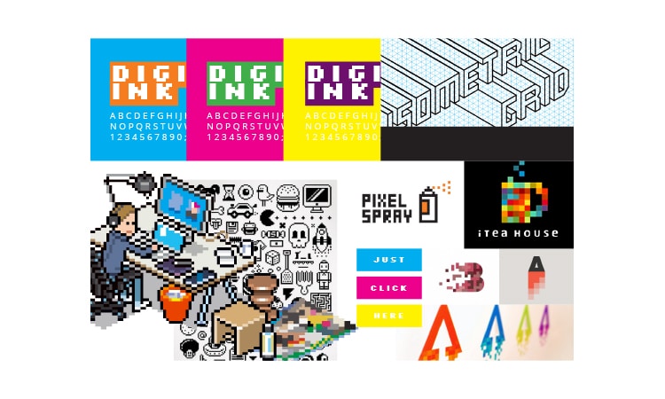
For our first mood board, we explored the digital side of Digital Ink. Specifically, we looked at samples of 8-bit art from retro video game systems like the NES, isometric pixel art, pixel logos, and pixel fonts. For this style direction, we focused on bright, bold colors to pair with the chunky pixels.
We decided that while this look could be fun and exciting, we feared that from a practical stand point, it could be difficult to implement effectively, and just didn’t feel like us.
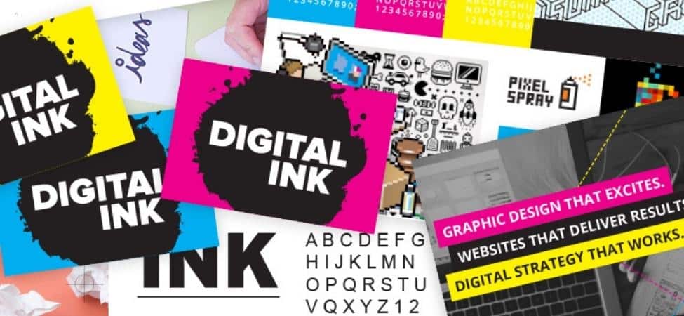
For the second mood board, we gathered samples that focused on ink and design. Thinking about ink brought to mind the artistic and creative process, the texture of paper, printing presses, reading thoughtful stories in the newspaper on a quiet morning, getting work done in the studio late at night, and writing and the expression of ideas.
To us, this meant bringing in elements from the print production process, like the CMYK color palette and crop and registration marks and combining it with stylish imagery and modern fonts.
After discussing the relative merits of each approach, we knew that the second mood board was the visual direction that we wanted to pursue for our rebranding.
Rebranding Step 2: Logo Iteration
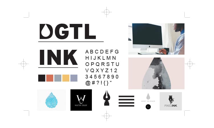
![]()
Based on the exploration we did with the mood boards, we knew we wanted a logo that was inspired by inkblots and ink drops on paper.
One of our goals when we began was to retain a familiar look and feel with our old branding for existing clients, so that when they saw our new branding they knew they were doing business with the same company. To that end, we began by sketching new logo designs that incorporated the “dots” or “spheres” from the Junger Media logo to form ink drops.
We tried various kinds of classic ink blots shapes, such as graffiti-inspired styles with dripping ink, cartoonish “gak”-like splats, airbrush textures, sharper and softer border lines, simulated brush spray, smaller spheres, larger spheres, and so on.
It was at this stage that we did something that I feel was extremely important for any branding initiative: we focus-grouped the different shape options we had created. We didn’t have the time or money to do a sophisticated focus group, so instead we asked friends, coworkers, and loved ones to identify the most familiar “inkblot” shape from the options that we presented to them.
Our results were certainly unscientific, but it helped us decide on the final logo form.
Rebranding Step 3: Typography
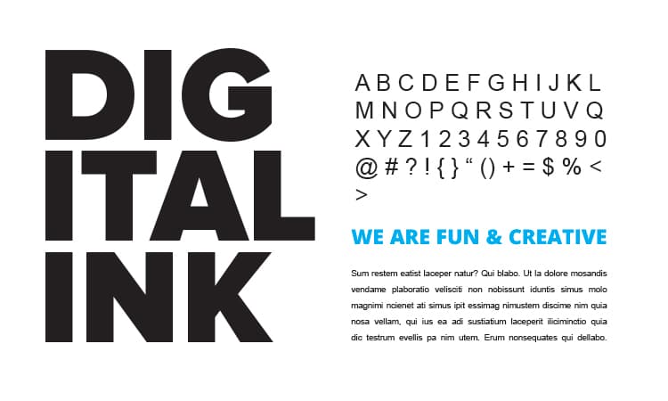
After exploring different permutations of the logo form, we still had to find the perfect typeface to accompany it. Besides finding a specimen that looked good in the logo form, it also needed to extend throughout the website and the rest of our new branding.
In our mood board exploration, we gravitated strongly to modern, simple sans-serif fonts. which helped to narrow our choices. We also had to find a typeface that included bold and heavy weight variants to balance the movement and energy of the logo form. To help narrow our options further, we used Google Fonts to refine our search.
Once we narrowed it down to a few different options, we compared the fonts and the logo form to see what worked best, and found that we loved Proxima Nova for the logo, but didn’t like it for basically anything else. So we decided on Open Sans, which we had originally selected for the logo, has many different weight variations, and looks strong in combination with Proxima Nova, to use on the website and elsewhere.
Rebranding Step 4: Updating The Website
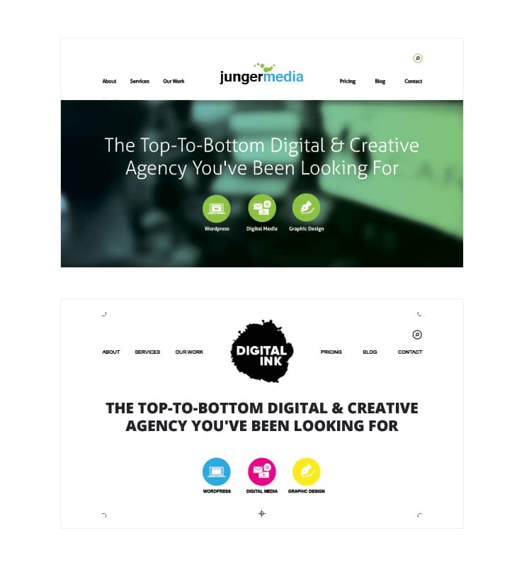
Now that we had developed our logo and common style guide, the rebranding was almost complete and the launch of the new brand was almost upon us.
That meant redesigning the website, as well as other collateral, like our business cards and sales sheets, to conform to our new branding. Since we had given ourselves a relatively short timeframe for the launch of the new site, we focused on finding ways to keep most of our existing templates intact, while finding ways to integrate our new branding elements.
We can use the homepage as an example. It is obviously quite similar. The five distinct sections (navigation, hero image, portfolio, blog, and footer) are represented in both sites, but we found sensible places to add our new styles, while also adding new elements like printing marks and a call to action to contact us.
Launch and the Future of Digital Ink
We officially relaunched as Digital Ink at the beginning of 2016.
Our number one goal with the rebrand was to make sure that we had room to evolve it after the initial launch. While we were (and still are) very happy with where we ended up with our rebranding efforts, we know there is still a lot of work remaining to be done.
There were ideas that we had that simply due to our time constraints we either didn’t have time to do or to perfect to make it work. We have already begun to work on those continued evolutions, and you’ll see the results of them in the near future.