7 Outside-the-Box Package Designs
Do you relish in the experience of unboxing a new Apple product?
Have you ever been suckered into purchasing something because you loved the packaging?
Just like print and web design, packaging design – encompassing both the structure of the package as well as the aesthetics – is very intentional. Each font, color, and material is carefully curated to make that product appealing to you.
And with all the options we have today, it’s more important than ever for brands to stand out.
Let’s take a look at a few truly unique packaging designs.
Not Your Grandma’s Perfume
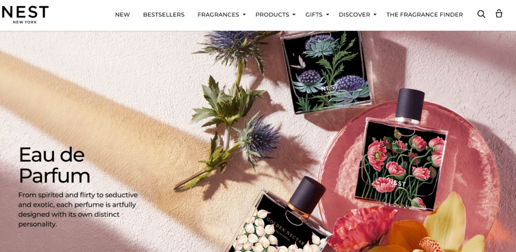
Source: Nest Perfume
Nest Perfume’s modern, vibrant take on vintage botanical illustrations can be viewed through the bottle.
The bright imagery paired with the dark background and matte black cap help Nest achieve a unique edge against the sea of typical pink, crystal-encrusted perfume bottles.
If I Fits, I Sits
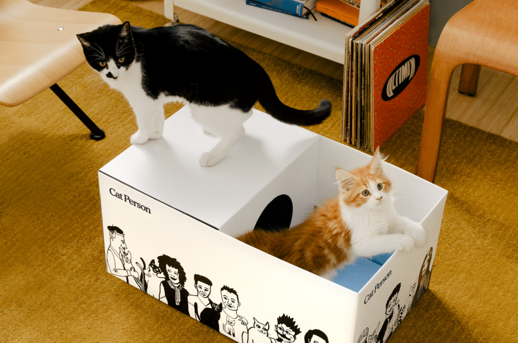
Source: Cat Person
Featuring a line of food, treats, and accessories for cats, Cat Person takes its name to heart.
Cleverly, the cardboard packaging used for shipping serves a second, genius purpose. After removing your goods, you can easily restructure the box into a play space for your cat.
As any cat owner knows, no matter how much money you spend on fancy beds, cats will always end up in the box is shipped in.
There are a variety of styles, but my favorite has to be the one that doubles as a puzzler.
Bravery Badges
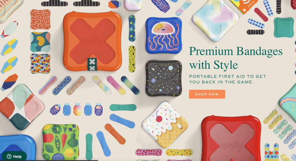
Source: Welly First Aid
Welly’s “Bravery Badges” aren’t just stylish, the reusable tin containers that they come in are adorable.
The use of bright colors and fun patterns are a far cry from your standard pharmaceutical beige bandage.
These whimsical bandages are a great way to grab a child’s attention, and take any shame out of needing a little first-aid for their latest boo-boo.
Packaging Beyond the Norm
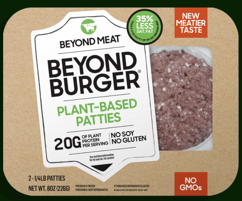
Source: Beyond Burger
Beyond Burger’s choice to place their plant-based patties in trays reminiscent of regular meat is quite clever.
The container has a straightforward design, displaying key nutritional information. By presenting the product this way, they position the patties as a familiar food rather than a lab creation of unknown origin.
A Cut Above the Rest
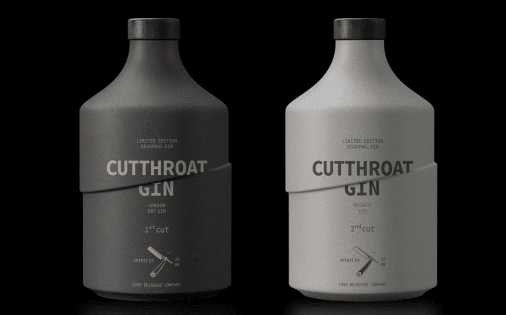
Source: Cutthroat Gin
Giving meaning to their name, these bottles are ingeniously designed to look like they’ve been sliced in half.
The design utilizes easy-to-read fonts and a minimal color palette. Rather than focusing on botanical elements or vintage lettering as many other gin brands do, Cutthroat stands apart from the crowd with this unique design.
Buzzin’ for Lightbulbs
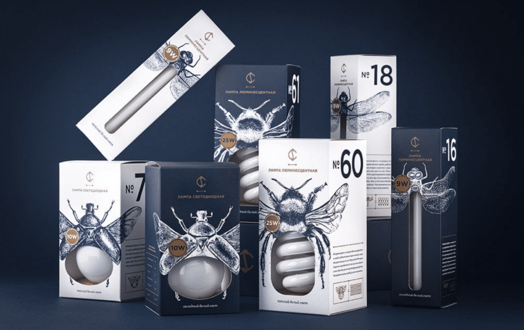
Source: Lightbulbs
These lightbulbs may be a concept piece, but how clever are they?
By using the open area to display the product, the bulb also fills in as the body of each insect. The illustrations wrap around the side, which makes for a nice display when the boxes are set side by side.
A simple color palette and plenty of white space allow for the light bulb to be the center of attention.
Arts and Crafts
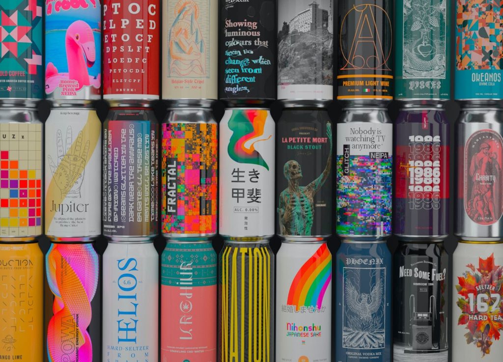
Photo by Studio Blackthorns via Unsplash
The craft beer market has exploded over the past several years, providing ample opportunity for unique label design.
It would be impossible to choose just one, so here are a few of my favorites:
- Aslin Beer Co. Aslin uses bold colors and shapes, evoking the 90s/nostalgia style that is very much on trend right now. No two designs are alike, and yet they maintain a cohesive feel. Laser Raptors is a highlight.
- Parish Brewing Co. Parish Brewing‘s labels are innovative and fun. Check out Holy Ghost, a “Mind Melting IPA” that employs holographic imagery of a melting skull full of hops.
- Flying Dog Flying Dog hired Ralph Steadman to create these illustrations. If the style looks familiar, it’s because Steadman is known for his work with Hunter S. Thompson.
- Juneshine Even though Juneshine is technically a hard kombucha and not a beer, they are definitely worth mentioning. The cans are quite minimalist on the front, with textured illustrations around the back. The illustrations are adapted from this artist’s travel prints and lend themselves well to the laid-back, beachy feel of the brand.
Hopefully this exploration has helped you gain an appreciation for packaging design. The next time you’re perusing the aisles of a store, see what unique package designs you can find.
