The 4 Logo Variations Your Brand Needs
We’ve recently covered the fundamentals of logo design, so today, we’re going to take it a step further and dive into what makes up a flexible, professional visual identity: a brand suite with multiple logo variations.
Many organizations believe they only need one logo, but the truth is, that can be limiting. A single logo won’t always scale well and fit into every space. What truly makes a good logo is having a full suite of variations to tap into for different use cases.
Your brand suite is a collection of logos that work together to form your visual identity, with each version designed strategically to serve a different purpose.
Let’s talk about the four essential logo variations that every brand should have and when to use each one.
1. Primary Logo
Your primary logo is the most recognizable version of your logo. This is the variant that you should reach for the majority of the time. It typically includes your brand name, tagline (if you have one), and any graphic elements your brand uses.
As the most complete variant, it should be used anywhere you want to make the strongest impression, such as your website header, business cards, signage, and other marketing materials.
Let’s take a look at Spotify’s primary logo as an example. You’ll notice it is in horizontal format, featuring a graphic element and their brand name:

2. Secondary Logo
The secondary variant is a rearranged version of your primary logo, offering more flexibility. For example, it may be stacked instead of horizontal (or vice versa), and you may remove the tagline here for a cleaner look.
This is the best version to use for applications when space is limited, or a different layout fits better. For example, in social media graphics, flyers, presentations, or print items.
Spotify’s secondary logo, while phased out of their current brand assets, is a perfect example, offering an alternative stacked layout:

3. Wordmark
As the name suggests, a wordmark is a logo variation consisting of just your brand name, without any additional graphic elements. It should be styled in your brand typography and have a clean and professional look.
This version works well in your website footer, as well as in professional applications, such as documents and letterheads.
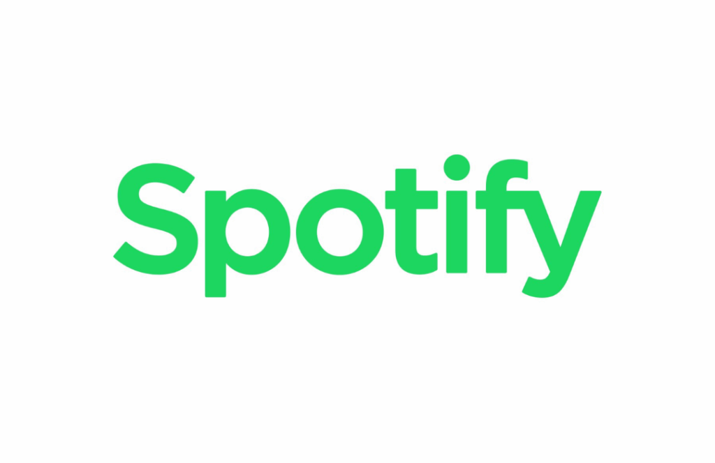
Here’s Spotify’s wordmark logo, without any graphic elements included:
4. Icon
Your icon is a standalone, simplified graphic from your logo without any text included. This is the most minimal logo variant in your suite, which makes it perfect for use cases where space is limited.
Your icon works best for your website favicon, social media profile picture, branded merch, or watermarks.
In Spotify’s icon, you’ll notice it is still instantly recognizable, even without the brand name:

Each of these different types of logo variations plays a key role in helping your brand show up consistently, regardless of platforms or formats. You’ll also want to be sure to outline each of these variants and how to use them in your brand guidelines.
If you need help or have any questions about building out a strong branding suite, reach out to us!