5 Creative Favicon Designs and Why They Work
These days, pretty much every website on the Internet has a custom favicon; the icon displayed next to the website title in a browser tab.
However, not every favicon design is good. There are many examples of bad or poorly thought-out designs.
In a previous post, I outlined a few best practices for creating well-designed, branded favicons.
Those best practices are as follows:
- Keep it simple
- Check your colors
- Quality matters
Here are five brands that produced creative favicon designs by following these best practices, and thinking outside of the box.
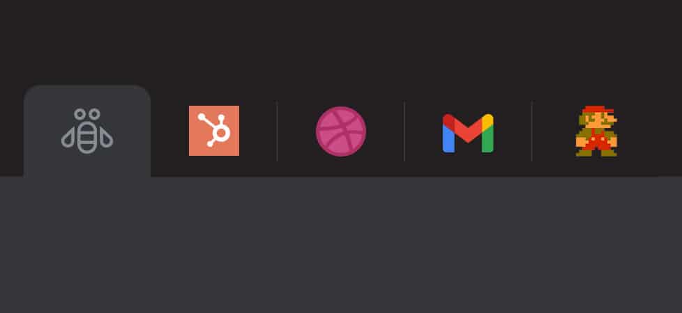
IBM Brand Microsite
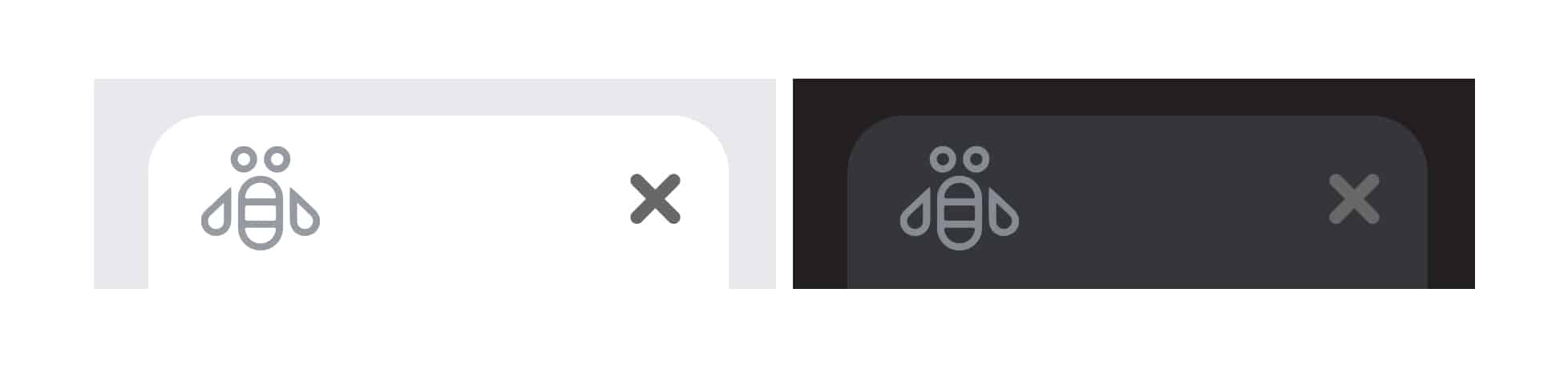
Favicon image courtesy of IBM
The IBM Brand Microsite favicon adheres to the best practices: It uses simple shapes and works in both light and dark browser modes.
IMB could have gone the easy route and just used the iconic IBM logo, but they chose a more creative option. Had they used the classic IBM logo, the text might not be super clear, but the brand recognition from decades of use would have been substantial.
Instead, their design references a Paul Rand designed poster called the Rebus for their THINK ad campaign from 1981.
The main IBM site gets points docked for using also using the Rebus Bee, but in this case not adjusting it for dark mode.
HubSpot
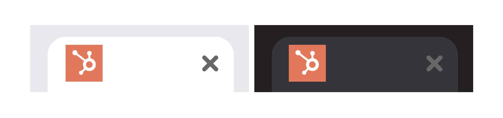
Favicon image courtesy of HubSpot
The HubSpot favicon works well because it utilizes their logo, which is comprised of very basic geometric shapes, in an effective manner.
Instead of just using the logo on a transparent background, which could allow it to be bigger, they’ve framed it in a bright orange square consistent with their brand palette.
Doing so ensures it is consistently sized on all platforms and works in light or dark browser modes.
HubSpot’s motto is “Powerful, not overpowering.” So while their design is basic, it aligns well with their brand.
Dribbble
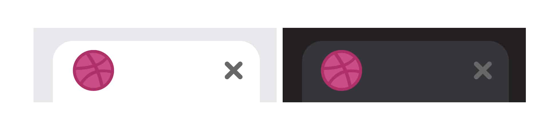
Favicon image courtesy of Dribbble
The Dribbble favicon stands out because they pivoted from their text-based logo, which wouldn’t work with best practices and would most likely be illegible at the standard favicon size.
Dribble took a new approach and used an alternative logo — a pink basketball — which they also use as their social media share icon.
This is a great example of using a favicon to extend your branding in a really creative way.
Gmail
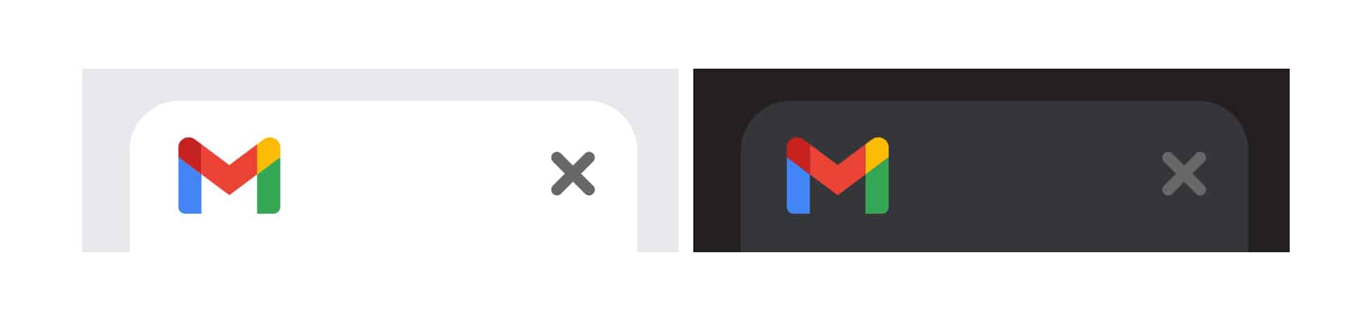
Favicon image courtesy of Alphabet
Gmail is an interesting example because with so many colors in their brand palette, their favicon could easily be a mess.
However, their favicon design leverages the variety of eye-catching colors that works well in both light and dark browser modes.
Gmail is a testament to creating a complete design system, where a few colors arranged in different ways can represent a dozen different products under the same brand.
Nintendo
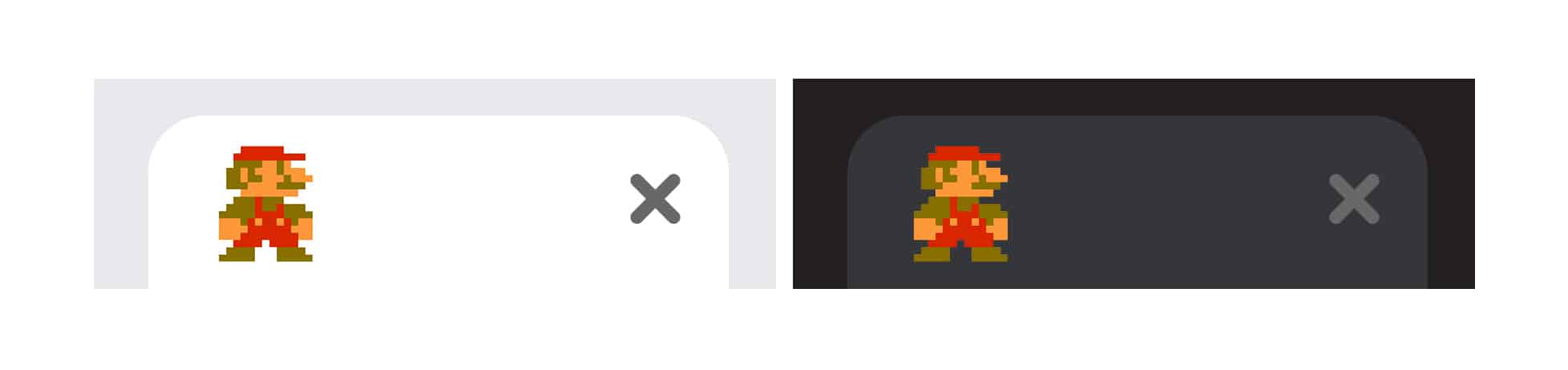
Favicon image courtesy of Nintendo of America Inc.
I saved the best for last.
Nintendo has a massive amount of mascots and memorable characters from decades of hit video games; each with their own worlds chock full of iconic symbols. They have no lack of source material for a creative favicon design.
They also have their own instantly recognizable Nintendo logo with decades of brand loyalty. But going back to the design best practices, their logo wouldn’t work well, as the text would be illegible.
Like IBM, Nintendo chose to use a design that references their brand history — in this case, Mario’s character design from the original NES Mario Bros.
The design is effective because it’s an iconic, pixel-based sprite that stands out in both browser color modes, and triggers a nostalgia factor for many users.
Let’s Go
Because it’s a critical part of making your website stand out above the crowd, go the extra mile to design a creative favicon that sets you apart.
Let us help you design the best favicon for your website.