What Makes a Good Logo?
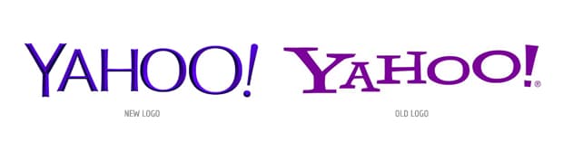
There’s been a lot of frothing at the mouth over Yahoo’s new logo, so it seems like a perfect opportunity to discuss some of the things we think about when we’re forging a new brand identity. Here’s what we’re always asking (and what we assume Yahoo did, too).
Is it Brand-Appropriate?
Part of the anger towards the new Yahoo logo has a lot to do with how people viewed the brand. For over a decade, they presented themselves as a silly mashup of Google and Ricola. Who doesn’t remember the “Ya-hooooo” ads? The new simplified form could be a logo for just about anyone, and thus suffers from a lack of identity.
Is it Memorable?
Asymmetry, inconsistency and charm; any quality that sets it apart can help a mark leave a lasting impression. Yahoo’s old, inconsistent cartoonish slab-serif design was at least memorable.
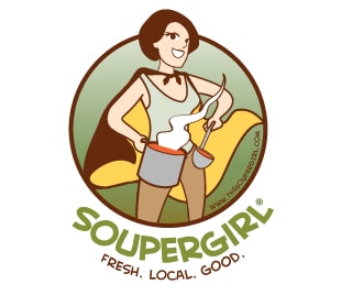 One of our first logo design projects was for Soupergirl, a café and soup delivery business in Washington, D.C. For that project, we talked with the Soupergirl herself to get a good idea of what she was like and what her business was all about. Most importantly, we tried the soup (and it’s great). What we created was a super-heroine done in a cartoonish Hanna-Barbera style. When you see her logo in the wild, you’re much more likely to remember it than if, for example, we had only used the text without the illustration.
How Do the Colors and Shapes Affect It?
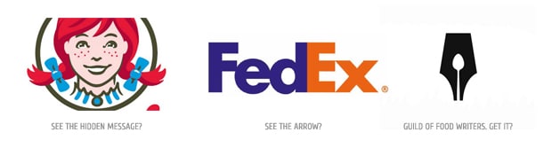
You can score major cleverness points by using negative space to your advantage. Below are a few of my favorites (the Guild of Food Writers logo is so good it almost makes me angry…) The GFW logo is a great example of a simple, attractive logo that relies solely on shapes to convey what the company is all about.
Additionally, you can use shapes that invoke specific aspects of the brand. In the FedEx logo, you can spot a forward moving arrow between the letters “E” and “X”. With that one “non-existent” arrow, you know immediately what FedEx is all about.
Wendy’s is also on board the subliminal message train. They recently updated their logo to include the word “mom” in Wendy’s collar, evoking a sense of family and warmth that Wendy’s wants you to feel when you eat at their restaurants (Editor’s note: Fries + Frosty = Maximum Deliciousness)
![]() We had our clever hat on when we created a logo for the Foresight Alliance, a research and consulting group that specializes in strategic foresight and planning. The mark that we created for them is a tangram — a puzzle consisting of seven flat shapes, called tans, which when put together form shapes. The tangram and arrow is representative of the Foresight Alliance’s ability to plan for any number of possible future scenarios.
We had our clever hat on when we created a logo for the Foresight Alliance, a research and consulting group that specializes in strategic foresight and planning. The mark that we created for them is a tangram — a puzzle consisting of seven flat shapes, called tans, which when put together form shapes. The tangram and arrow is representative of the Foresight Alliance’s ability to plan for any number of possible future scenarios.
At the end of the day, it’s most important for a logo to be simple, but not so simple that you eradicate any kind of unique brand identity (see above).
Ready to create an amazing logo for your business? Contact us today and let’s make it happen.