What Does the Font Say?
Every day, consumers form opinions about brands and products based solely on how they look, so it’s important to create a positive bond with a potential customer by presenting them with consistent visual branding.
If a consumer is repeatedly exposed to a cohesive and easily digestible message, they’ll come to remember it and develop an emotional connection.
A well crafted brand comes from understanding the target audience and aligning the visual elements of the brand with the message that needs to be communicated. Because of its power to create a sense of recognition and familiarity, good typography is an integral part of building identity through messaging.
Good design paired with proper font selection can be incredibly effective in making a long lasting impression.
The Right Font Matches Your Brand’s Message
As an essential element of design, typography and font choice is extremely important when trying to communicate ideas or emotions. You want to pick a font that reinforces the meaning of the text. The shapes and curves of the letters do more than just determine readability — they convey personality.
Selecting a font is like picking out the right clothes; just like you choose an outfit according to the occasion, you should use a typeface appropriate for the message.
Here’s some fonts that don’t work because they don’t match the message.

Like clothing, fonts help to visually express identity to the outside world. Typography can be used to easily express the individuality of businesses, organizations, people and even places.
A Favorite Font Expresses Your Personality
Having a favorite font is similar to your favorite pair of jeans – they become your go to choice. While a lot of designers may have an affinity for Helvetica, two of my favorite sans-serif fonts are Avenir and Knockout. All three come from large-type families with diverse styles, making it easy to express a large range of emotions and designate hierarchy.
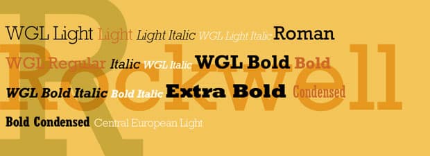
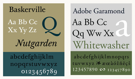
Much like my favorite party dress — which is bold and attention grabbing — my all time favorite serif font is Rockwell. But due to its strong style, I can’t use it as a design staple like, for example, Baskerville or Garamond, whose classic characters are nice and neutral, making them easy to pair with other louder fonts.
When selecting a font, I try to think of how it might work with others. Though choosing one font might seem daunting, selecting two or even three fonts is a headache. There are many rules and design principles that one can follow, but in the end the whole process is very intuitive.
A good approach to mixing font families is to try to keep one quality consistent and let the others vary, allowing you to maintain unity while adding in variety.
Every Font Has a Voice
Type is everywhere, and thanks to the web, there is no shortage of fonts to choose from. It’s easy to get a bit carried away, so with so many choices it’s good to keep in mind the font you choose can say more than the message itself; each font has a voice and what one might say another doesn’t.
A sans-serif font can come off clear, objective and modern, or it can seem cold, impersonal and boring. The tools are there for everyone to use, and the Internet has made amazing fonts universally accessible, so there is no excuse for settling with the default font choice.
You don’t want to look like someone who has yet to discover the “Fonts” menu.