Need a Font? These Fonts Look Amazing
by Jason Forrest
Insights / Graphic Design /
Finding a unique and usable font can be really difficult. When I’m working on a new design, I can easily spend way too much time obsessively combing through every font I have installed on my computer. Not to mention the dozens upon dozens of pages worth of fonts on the various typography sites out there.
I’ll be honest, I often end up relying on resources just like this post, written by other designers who’ve also spent far too many hours agonizing over the right fonts, to see which ones they think are the most fantastic fonts out there.
So to pay it forward, because you need it, here are some fonts that I think look amazing.
Bely
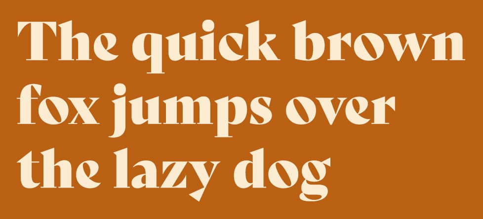
I’m starting this list with this font because I’ve wanted to use it for a while now, and I just haven’t found the right project. Chunky serif fonts are all the rage right now, so I know the right opportunity is guaranteed to come along sooner rather than later.
In the meantime, I hope you’ll find a use for it.
You can find it here.
Reross Quadratic
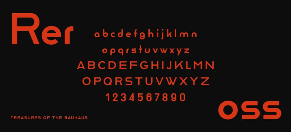
I’ll start this one off with an undeniably cool font fact: It was revived from the iconic Bauhaus school of design by legendary typographer Erik Spiekermann (FF Meta, Fira Sans, etc.).
I’ll admit that I don’t particularly love the sentence case version of this font. While it is certainly unique, I think it would be challenging to use effectively in most designs. However, I love the uppercase version. It’s screaming out to be used in a logo, on business card, or any place to add a stylish flourish.
Just look at the shape of the W. It’s like Raleway, but way cooler.
You can find it here.
ITC Souvenir
I have refused to include Cooper in this list, because it is already incredibly popular and overused.
So instead I’ve chosen what one designer described as the Comic Sans of the 1970s. Because if you’re going to use a trendy font, at least it can be a more unique version of that style.
You can find it here.
Adelle
This is admittedly not the most glamorous or “out-there” choice. That hasn’t stopped it from being one of the most popular slab serif fonts out there.
It is crystal clear at small sizes, and avoids looking overly precious or silly like so many slab fonts often do, such as Archer for example.
Therefore I’m filing this one under amazing, for being incredibly versatile without being incredibly annoying.
You can find it here.
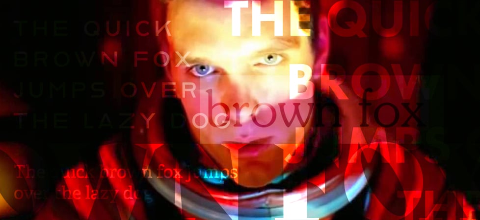
Futura
I’m sure there is a decent chance that you’re already familiar with Futura. It has been steadily popular since the 1920’s. That’s 100 years! But there’s a reason for that. It just always looks so sharp (now I sound like I was born in the 20’s).
I love using it at a giant size for banners and posters. It works flawlessly placed on type or bright colors. But it’s also a great body font. Just ask NASA.
You can find it here.
Still need help finding an amazing font?
Contact us and we’ll see how we can help you dig to find the most amazing font for your project.
About Jason Forrest
Digital Ink tells stories for forward-thinking businesses, mission-driven organizations, and marketing and technology agencies in need of a creative and digital partner.
Other Stories You May Like


#/media/File:Apollo11Plaque.jpg)