Visualize Your Data: 5 Different Techniques
by Gina Armstrong, Lead Designer
Insights / Website Design /

Photo by Josh Calabrese via Unsplash
As designers, one of our main objectives is creating visual representations of ideas – and whether the task is creating marketing collateral or designing a new website, visual elements play an important role in telling the story. Color, typography, and imagery are essential components of any design – but there are additional approaches for visualizing your data.
Here’s a breakdown of 5 different visual elements we like to use.
1. Icons
Source: Blackbaud
Icons provide visual cues that can help users discern information quickly and effectively. Since many symbols are universally understood, they are particularly useful for directing users to certain areas of a website – such as the search feature, social media links, or accessibility tools.
In the example above, icons are used to make the navigation process easier. With the help of icons, a user can scan a large list of services and quickly determine where to go. Additionally, the use of icons makes an otherwise bland list of text more visually appealing.
A well-designed set of icons helps reinforce branding and contributes to the overall look and feel.
2. Illustrations
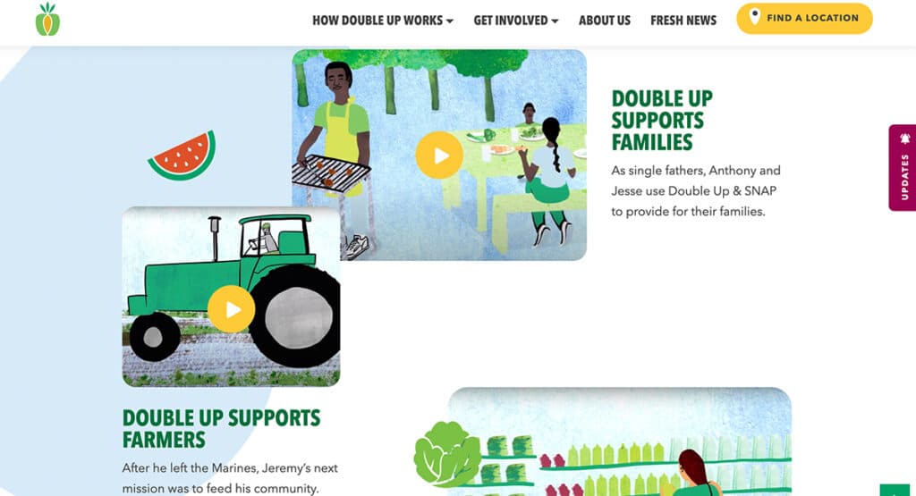
Source: Double Up Food Bucks
Illustrations add a personalized touch to designs, creating a unique brand identity. Similar to imagery, illustrations are a great tool for creating a story that enhances your content. There are a variety of illustration styles, each with its own characteristics and tone.
In the above example, hand-drawn illustrations help humanize the story, creating a warm and approachable look that may not be possible with stock images.
3. Statistics
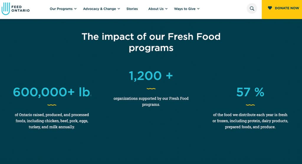
Source: Feed Ontario
Incorporating statistics can help increase the impact of your site. By sharing specific data around your work, you create a sense of validity and reliability. Simple designs that utilize large, bold text make data easy to scan – while also breaking up content on the page and creating white space for eyes to rest on.
In this Feed Ontario example, the large blue text draws attention, prompting users to engage with the content by reading more about each statistic.
4. Timelines/Maps
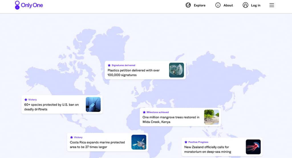
Source: Only One
Timelines and maps are unique visual representations of data, and they encourage far more engagement than blocks of text. They can also provide historical or geographical context, which makes that information more impactful. In the example from Only One, we can see the worldwide impact the organization has had on environmental protections, encouraging users to join the efforts.
There’s also a unique opportunity to make maps and timelines interactive by incorporating hover effects and/or animation.
5. Infographics
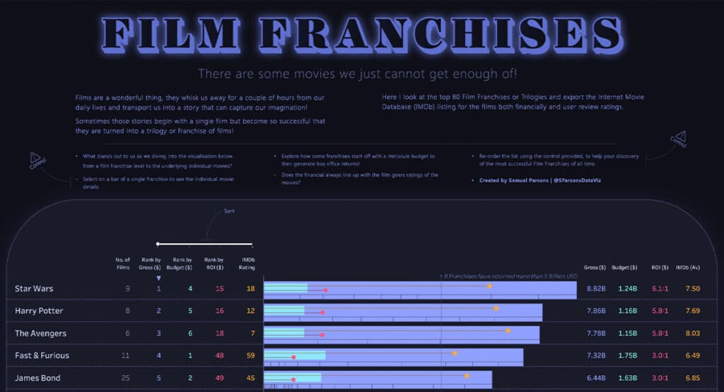
Source: Film Franchises
Infographics are capable of synthesizing lots of data into something more easily digestible. They might combine several visuals – including graphs, icons, and maps to tell a whole story. While infographics are frequently used in annual/financial reports, they are also great for sharing fun pop culture data, like the example above that compares popular film franchises.
There are a variety of ways to visualize your data, and each has its own strengths. When used thoughtfully, these techniques help communicate ideas, break up content, and produce interesting layouts. If you need help with your next project, reach out to us.
About Gina Armstrong
Gina is the Lead Designer at Digital Ink. Gina has explored design while serving various roles in the non-profit sector, developing a passion for branding and digital design. Digital Ink tells stories for forward-thinking businesses, mission-driven organizations, and marketing and technology agencies in need of a creative and digital partner.
Other Stories You May Like