Designing Icons: 5 Things You Need to Know

Symbols have long played a fundamental role in visual communications, serving as an important piece of way-finding signage, logos, machines and more. They have also become an integral part of design in the digital age. We rely on icons to communicate different ideas in websites, software, apps, and games.
As we’ve become more accustomed to the online world, certain symbols have become ubiquitous. Most everyone will recognize that an envelope represents ‘Email’ or that a magnifying glass means ‘Search’.
While icons often seem intuitive and simplistic, it can be surprisingly challenging to create new, effective icons. As a rule of thumb, there are five criteria that your icon should meet:
1. Visible at Small Sizes

Photo by Lisa Fotios via Pexels
Start by considering your medium and what size the icon will be.
For example, menu icons on mobile apps are small. Since details tend to become lost at reduced sizes, it’s crucial to keep the icon as simple as possible. You also want to ensure that the stroke weight is at least 1px at its smallest size.
Depending where the icon is being implemented, you may want to export as an SVG so that you have a vector-based graphic that will work at any size.
2. Universally/Easily Understood

Photo by Rob Wilson via Unsplash
Designing icons is not the time to reinvent the wheel! Since symbol interpretations can vary by culture, it’s important to choose something that will be universally understood.
Airport signage is a great example of a space where symbols must transcend language to communicate to people from around the world. The example above showcases simple icons in bright colors that are easy to interpret. Ideally, your icon should be able to stand on its own, without the need for accompanying text.
3. Evergreen
Despite universal recognition as the ‘Save’ button, today the floppy disk is an obsolete piece of technology. In an effort to avoid this kind of issue in your own iconography, try to boil down your idea to its most basic meaning.
For example, an icon for ‘Internet’ might demonstrate sharing ideas or connecting users, but shouldn’t be an ethernet cord or wifi router. If you’re struggling, you can use a resource like the noun project to help spur some ideas.
4. Consistent Stylistically
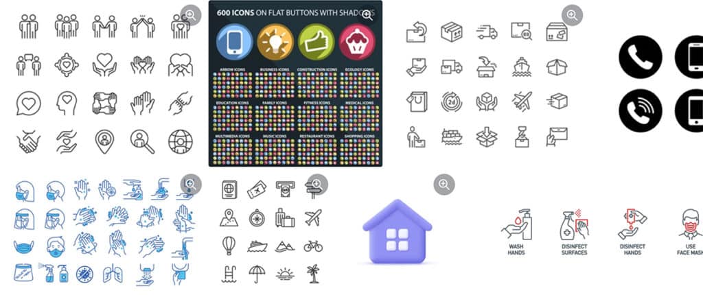
Via Shutterstock
There are several different icon styles including line icons, glyph icons, and 3D icons. You can browse some of the different styles here. When developing icons for your site, you’ll want to stick with one style throughout to ensure everything feels cohesive.
If possible, icons should be created as a set. This helps ensure they are consistent in size, stroke weight, color palette, and style.
5. On Brand
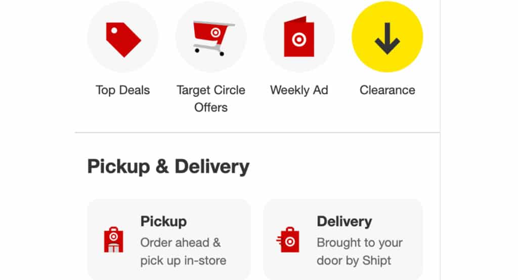
Via Target
This is the area where you can really personalize the look of your icons. Incorporate brand colors and be sure the style is in line with your brand’s overall voice. There may even be a way to incorporate your brand mark, as Target has with their icons.
As a final step, be sure to test icons with the rest of your site to confirm everything has a cohesive look and feel.
If you need support creating icons that streamline your ideas and make navigating your site a more pleasant experience, reach out to us. We’re here to help!