8 Brands Using Illustrations to Improve Their Designs
As our world is becoming more digital, it is increasingly difficult to capture your audience’s attention and keep them engaged.
Also, with AI resources that allow anyone to quickly create their own brands in a matter of minutes, the brand world is becoming more and more crowded.
So how can your brand stand out from the crowd and capture your audience’s attention? Illustrations.
Illustrations in brands can:
- Quickly portray your brand’s voice, identity, and aesthetic and tell your brand’s story in a visually appealing way
- Visualize abstract and hard-to-photograph ideas that can be specifically tailored to meet the needs of your brand
- Increase brand recognition, which allows your audience to quickly recognize your brand across multiple platforms
The list of benefits can go on and on, but most importantly, illustration is a powerful tool for storytelling, visual communication, and increasing engagement.
Before you start creating illustrations for your brand, consider your available time and budget, target audience, and overall aesthetics of your brand. Once you have carefully considered all of these factors, determine the art direction you want to take.
Choosing the right illustration style is crucial as it will immediately portray the voice and aesthetic of your brand. Some of the most common types of illustration styles include minimalist, flat vector, and character illustrations.
Let’s take a look at some truly eye-catching illustrations in brands.
8 Great Examples of Brands with Illustrations
1) Mailchimp (Minimalist Illustration)
Source: Mailchimp
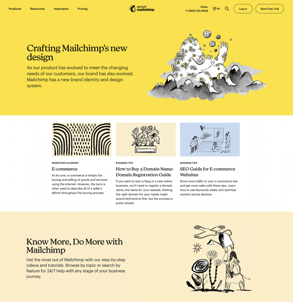
Mailchimp uses simple hand-drawn pencil illustrations and a minimal color palette throughout their website and marketing platforms. The mix of organic shapes and textures added through the use of charcoal and watercolor makes the brand less rigid and more personable.
Each of the illustrations tells a different story while portraying the various services they provide and keeping the overall voice and tone of the brand.
2) Headspace (World-Building/Character Illustration)
Source: Headspace
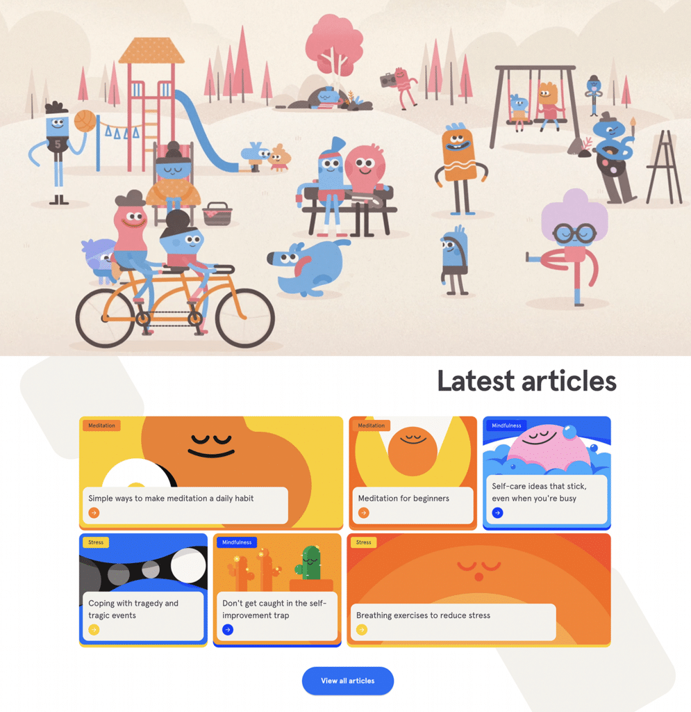
Through the use of illustrations, Headspace created its own world where whimsical and playful characters live in dream-like and calming environments. The inviting and welcoming nature of these characters and backgrounds are incredibly appealing and cause their users to want to join this fantastical world.
They created a perfect mix of engaging yet balanced illustration aesthetics that is soothing without being overwhelming. Through these simple yet eye-catching illustrations, Headspace was able to simplify complex concepts and nuances that come with self-care.
3) Fort Point Beer Co. (Geometric Illustration)
Source: Fort Point Beer Co.
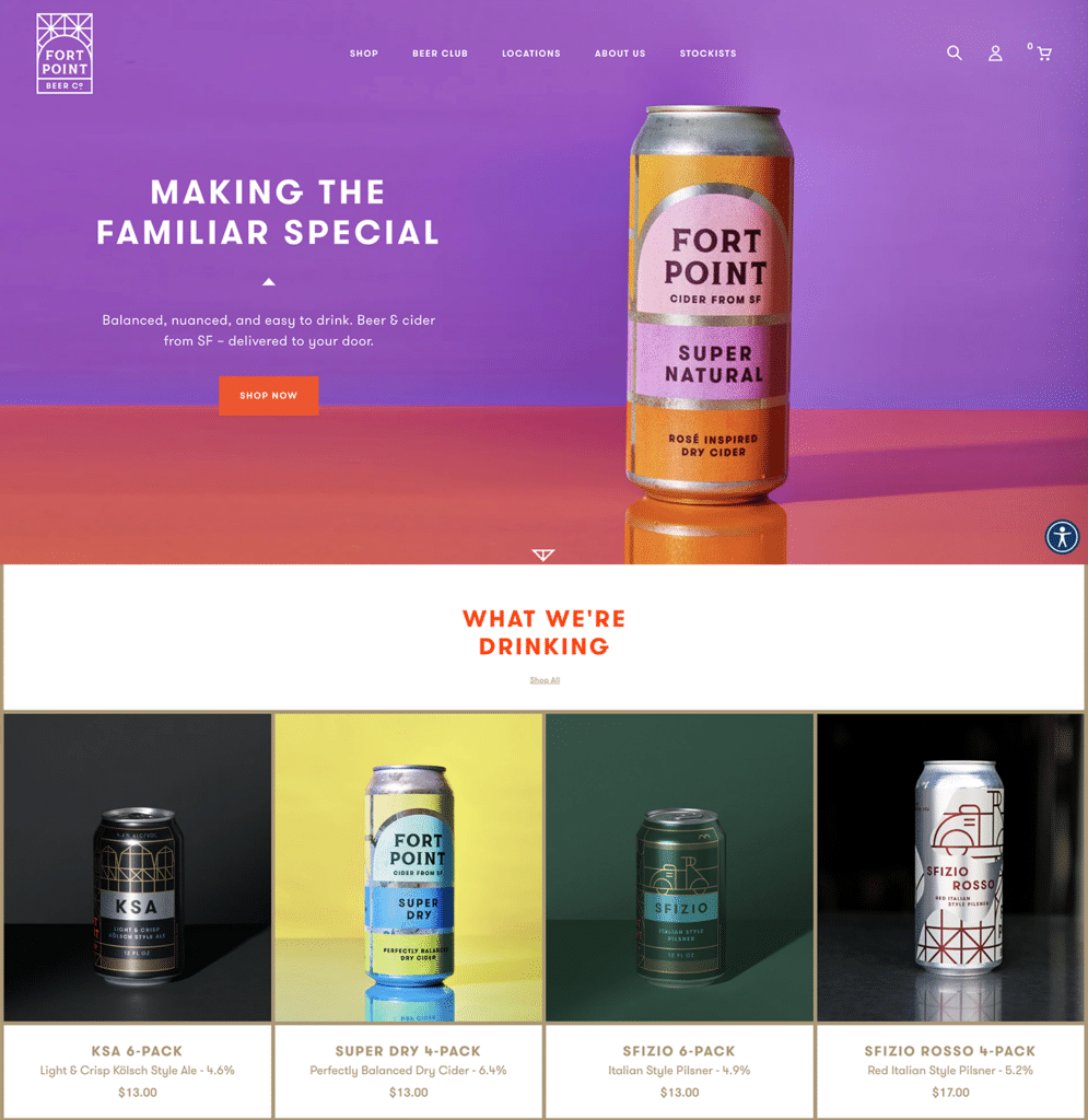
Fort Point Beer Co. has a geometric logo and they carry those geometric elements into their illustrations. The geometric illustrations create a sense of stability, sleekness, and modernness throughout their brand.
Also, their harmonious color palette allows for each of the geometric shapes to fit together well to create an overall appealing illustration.
4) Instacart (Flat Vector Illustration)
Source: Instacart
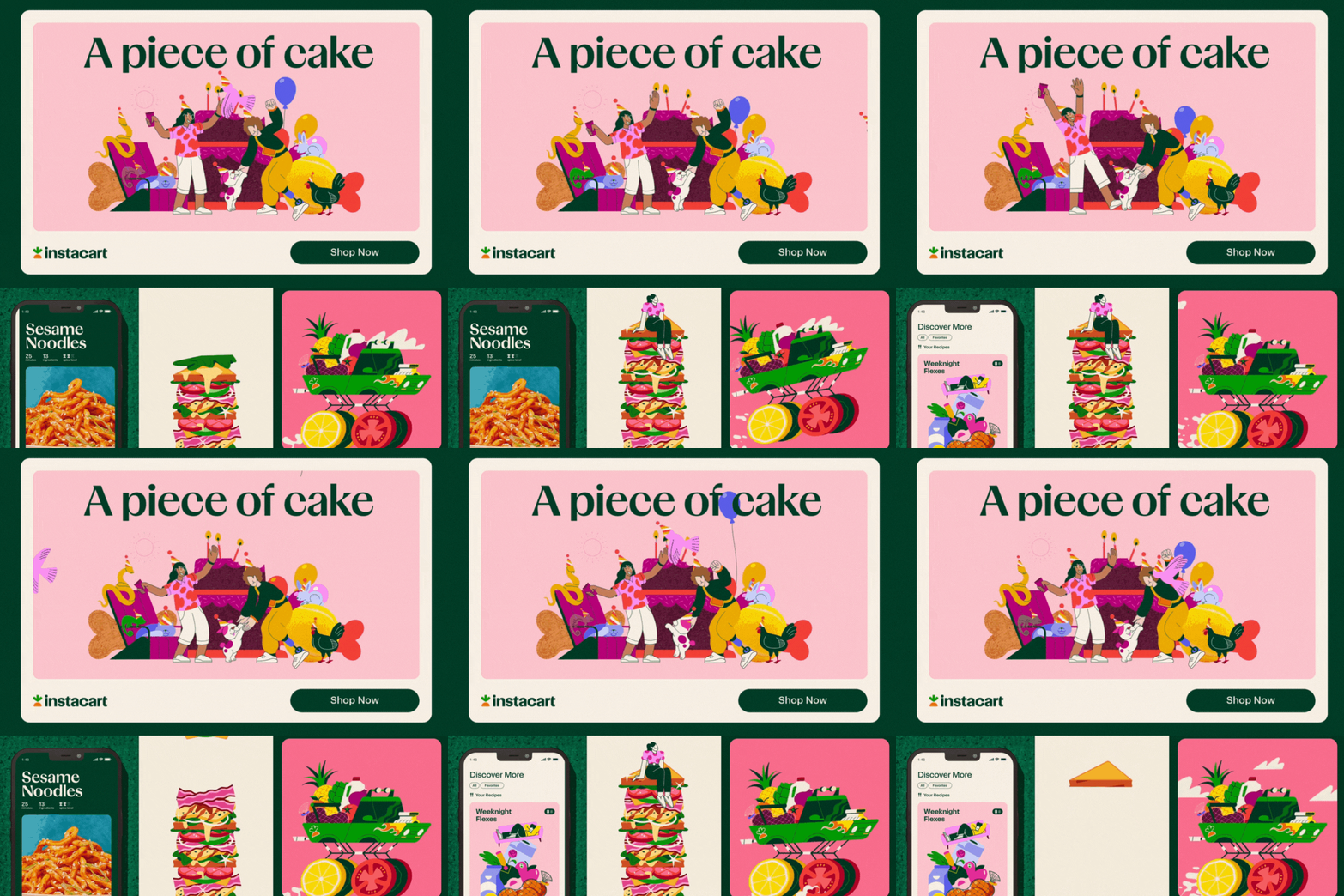
Instacart uses bold, humorous, and playful illustrations to attract its users. They use food illustrations in fun and varying ways to represent the services they provide.
There is a sense of consistency between each illustration through the use of limited pastel palettes and vintage, earth tones. All these elements of their illustrations work seamlessly with their brand’s typography and photos. Check out more of their illustrations here.
5) Colectivo Coffee (Vintage, Rustic Illustration)
Source: Colectivo Coffee
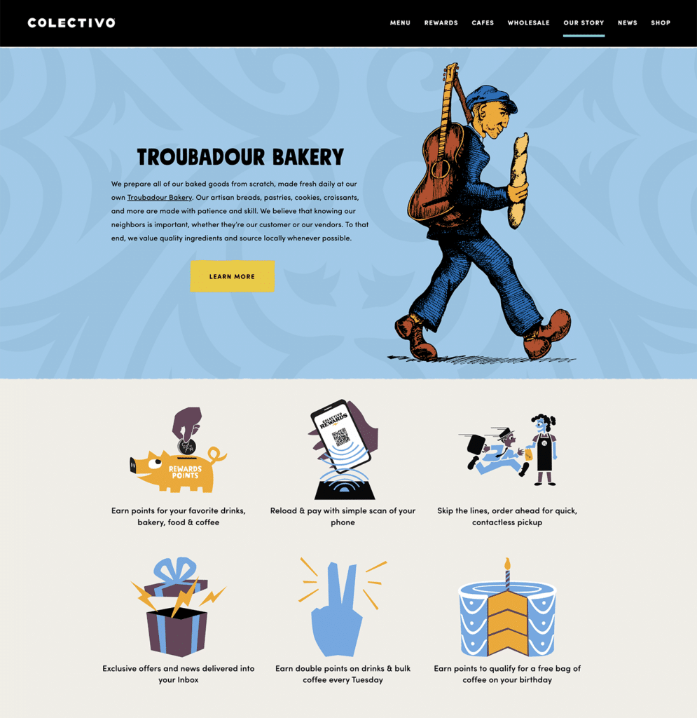
Colectivo Coffee uses black, vintage, and rustic pen drawings throughout their illustrations. The vintage feel can be seen from the line shading and textured black lines that resemble drawings from a 1800s newspaper.
While most of their illustrations give off a vintage feel, Colectivo Coffee still adds bits and pieces of modern elements by incorporating their simple and blocky typefaces and modern imagery (i.e. QR codes, rewards points, etc.).
6) Algoan (3D Illustration)
Source: Algoan
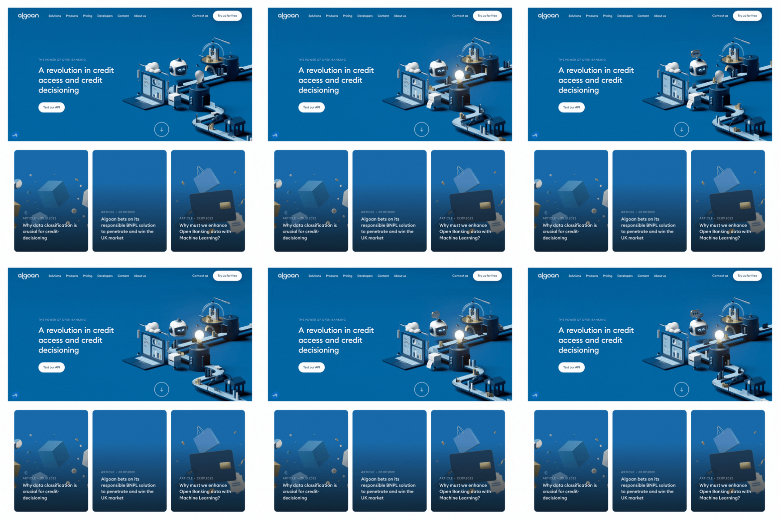
Algoan’s 3D illustration features their processes, services, and products that they provide to their clients while maintaining a level of professionalism.
An added bonus is that they animate their illustration to further intrigue their customers. Algoan keeps its consistency by carrying this 3D style to their blog post images, social media platforms, and newsletter emails.
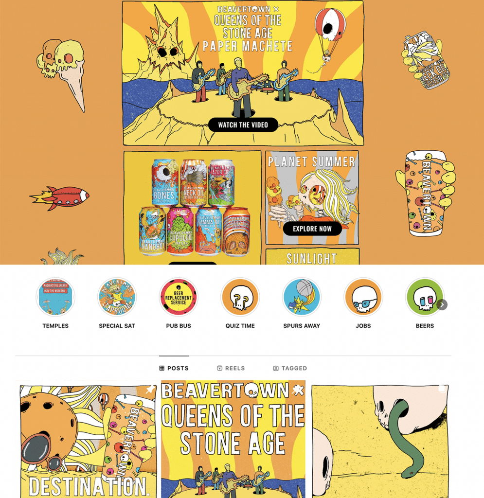
7) Beaverton Brewery (Cartoon Illustration)
Source: Beaverton Brewery
This illustration style has so much character and their entire brand looks like you landed on a page in a comic book. Little details like the hand-drawn rectangle elements around each of their illustrations mimic comic book strips.
On their Instagram, they even create short comics to feature their new drinks and upcoming music events at their brewery. These clever and creative ways of expanding on their cartoony illustrations are sure to keep their followers and customers interested and entertained.
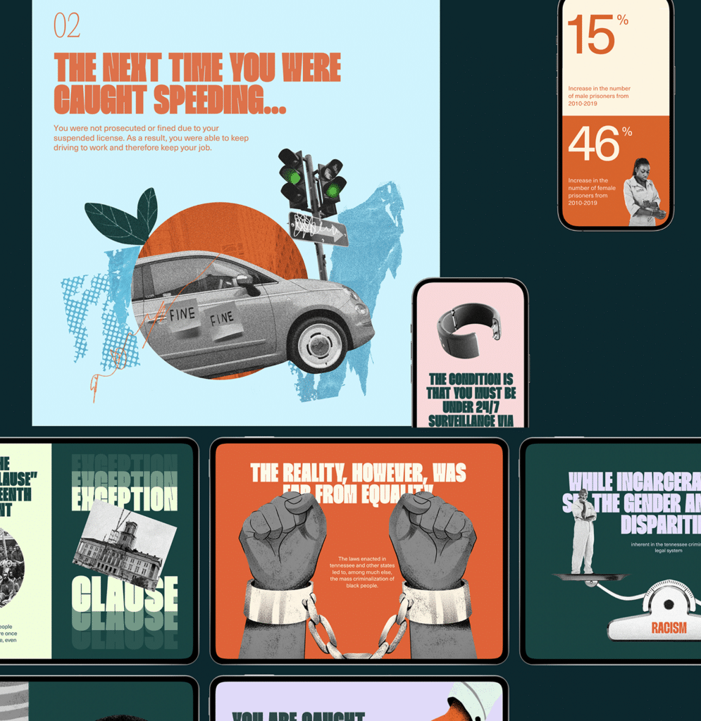
8) Decriminalize Poverty in Tennessee (Mixed Media Illustration)
Source: Decriminalize Poverty
Finally, this brand uses a mix of photo collages and illustrations to make their brand truly stand out and raise awareness. The layering of illustrations and different photos creates depth and textures.
This style of mixed media illustration is clever for this brand in particular because they use original photos of people and locations from Tennessee, which add a personal touch and are better able to connect to the residents in Tennessee.
Wrapping Up
Using illustrations in your brand can be incredibly helpful and powerful if used intentionally and thoughtfully. It is important to remember that all brands will continue to evolve as the marketplace changes. Therefore, be sure to evolve your illustrations as needed and keep in touch with the latest trends in design.
If you have any other great examples or need help creating your own illustrations for your brand, don’t hesitate to reach out to us.

