Want Good-Looking Content? Here’s How.
One of the most consistent recommendations we make to our clients engaging in a website redesign is that their content has to look good.
But what exactly does that mean?
“Looking good” sounds really subjective – beauty is in the eye of the beholder, after all – but if your goal is to get real people to read your content and take action, then you need to follow best practices for web content.
The #1 Rule: Your Content Must be Scannable
We’ve known since the early days of the web that people don’t read online.
A computer is not a book, and your website is not a page in that book.
People scan online: they look for the content that is interesting to them, read it, take action if necessary, and move on.
(If you’re reading this right now, do you know how much more effort you exerted than almost everyone else? I appreciate you!)
We talk so much about goals and calls to action because that’s what users care about, so that’s what you should care about.
Here’s how to make your content scannable.
Headers and Subheaders: Use Them
Your eye was drawn to the h2 tag directly above this paragraph.
That’s not guesswork – that’s a fact.
We see things that are bolder and larger and brighter before we see things that are smaller are duller.
Using appropriate headers and subheads allows people to:
- quickly see the structure of content
- determine which section contains the information they need
- dig into that section to find specifics and details
Organize your content in a way that makes sense to the people visiting your site, and easily explain to them what’s in each section with clear language and obvious headers.
Proper use of headers is also key for website accessibility – it allows user with screen readers to know that certain content is more important than others.
Bullet Points: Display Just the Facts
Whenever you have an opportunity to take long sentences and break them down into simpler ideas, do it.
If you can take your ideas and break them into short and sweet bullet points, that’s even better.
This works because:
- you’re more likely to read this
- than a really long sentence
- because it’s easier to read
Bullet points align well with the established F pattern in eye tracking studies; people read down and to the left, and only go so far reading to the right.
Keep your content in the range of their eyes, and they’ll be more likely to read it.
Keep Paragraphs to Under 4 Lines
This is simple: your paragraphs should rarely be longer than 4 lines (on a typical display).
If it looks overwhelming or too long to read, no one will read it.
Want to see what I mean?
This paragraph is going to have a lot of ideas in it, but because it’s more than 4 lines long, it’s incredibly unlikely that you’ll make it the whole way through (without doing so intentionally just to prove a point). Even if the sentences themselves aren’t that long, or if the content isn’t that complicated, just the fact that the content looks like it’s really long will make it that much more difficult for you to read – and if you’re just scanning the page looking for the one piece of information you need, you’re going to look at this paragraph and say, “I can probably find the answer with less effort literally going back to my search results and clicking on another link.” If your website content looks so overwhelming to read that people would rather go find another site to find what they need, you’re doing it wrong.
The Internet has taken away all of our attention spans, so paragraphs under 4 lines in total are usually only 1 or 2 ideas.
It’s not an ideal format for well-thought out analysis; if that’s what you’re creating, find a different way to deliver the message.
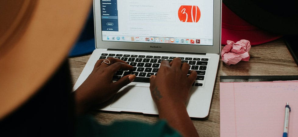
Use Buttons and Images to Disrupt the Content Flow
Like with headers, you should insert buttons, calls to action, and images throughout your content to draw in your user’s eyes when there’s something of value.
When all of your content looks the same, a person scanning it won’t easily know what’s important and what’s not.

You see those flowers? Of course you do.
If it wasn’t here, all of my content sections would just be text. Even though I’m following best practices for headers and bullet points and paragraph length, this image immediately attracts your eye because it’s different.
Use buttons and images where appropriate to catch your reader’s eye.
Variety is Crucial, Within Reason
All of these best practices help format content that looks good, is easy to digest, and helps the user take action.
Using different text formats, inserting images, calling out ideas as bullet points, and shortening your content makes boring content look less boring.
(I know, I know – your content is not boring. Everyone needs to read it, right away. Mine, too.)
Variety in your content presentation makes it more likely to be read because it doesn’t look overwhelming. It’s easy for the reader to find what they need and move on.
That being said, people still need to be able to understand how you’ve presented your content – it can’t be so flamboyant that it requires too much learning to figure it out. It’s like reading a different language – if I have to learn that language in order to solve my problem, I’m going to try and find a different solution first.
The Wrap Up
Reader, if you’ve made it this far (or this is your first stop, which is more likely), here’s how to make good-looking content:
- Your content must be scannable
- Insert headers and subheaders to organize content
- Use bullet points to break up ideas
- Keep paragraphs under 4 lines long
- Disrupt the content flow with images and buttons
- Keep variety in mind when creating content, within reason
Have any questions about your content presentation? Click the button below and reach out.

