What’s Next? Guide Your Website Visitors to Take Action
by Sarah-Leah Thompson
Insights / Content /

Photo by Jake Owens from Unsplash
Navigating a website and finding action items should be as easy as one-two-three.
Remember, your users came to your site for a reason. Their goal may be to purchase a product, subscribe to your newsletter, or leave a review. If your users can’t figure out how to accomplish their goal, they will give up and leave your website.
There are different ways to help guide your users to find the information they’re looking for. Here are our top recommendations:
Calls to Action
Having effective calls to action strewn across your website is very important for guiding your users toward clear next steps. Whether the next step is to donate, learn more, apply now, or to leave a review, you want to make it easy for your users to follow through.
The general rule of thumb is to house your call to action in a big, painfully obvious button.
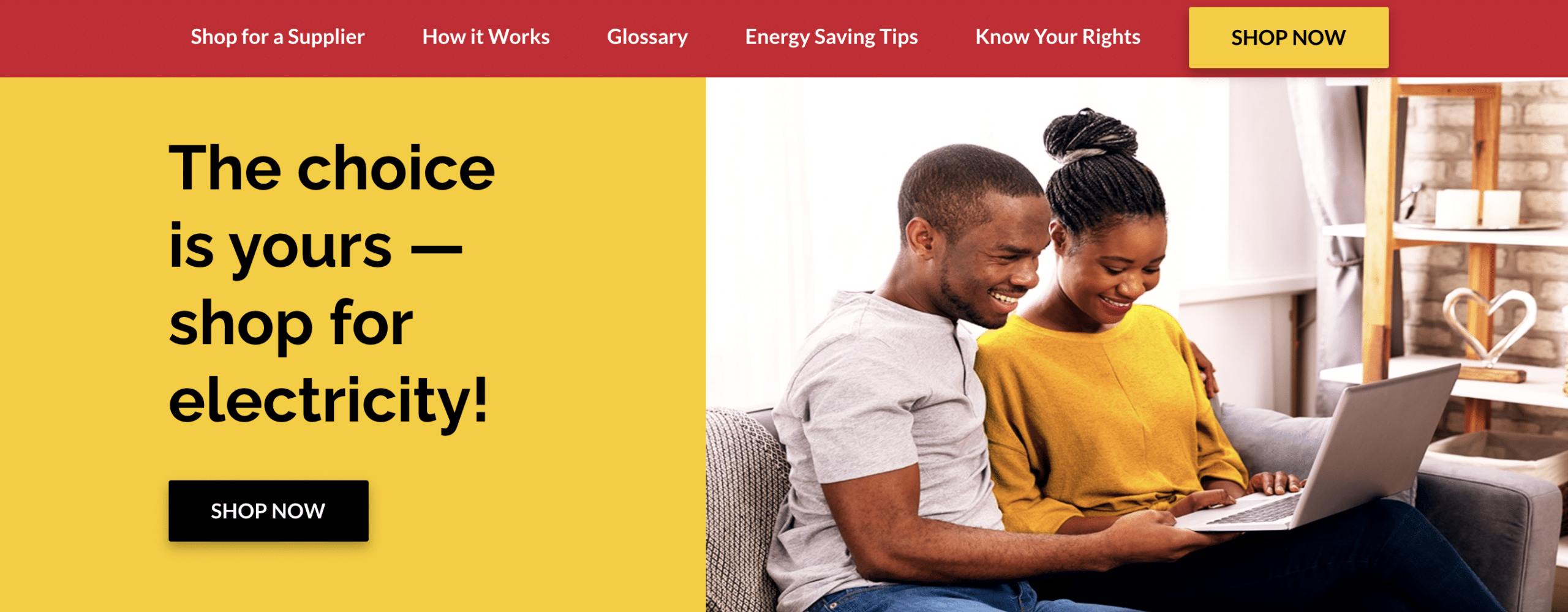
Buttons serve two functions: they catch the eye and they are linked to follow through on an action with minimal effort on the part of your users (just one click!). Here are 40 great examples.
Making the lives of your users easier ensures a positive user experience, and will keep them from bouncing off of your site in frustration.
Suggested Content
Think about that last movie or TV show you binged on Netflix – as soon as the credits began to roll, what popped up? A suggestion for what to watch next.
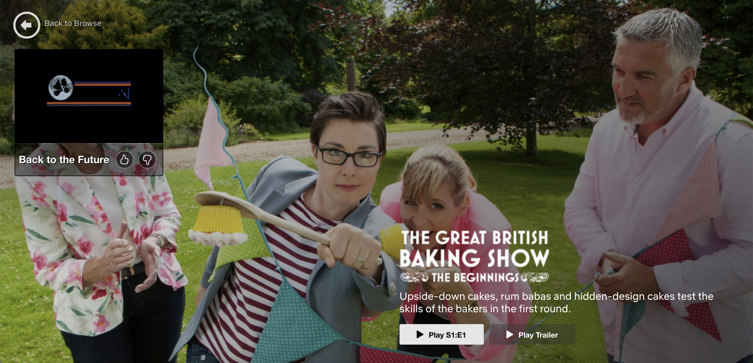
Suggesting related content to your users is an effective way to guide them through your website and offer new content.
Suggested content is everywhere. You’ve probably encountered it when shopping online, browsing videos on social media, or Googling a fun fact.
We took the hint and recently added “Other Stories You May Like” to the end of our blog posts (spoiler alert), featuring more posts within the same category. Now users can continue exploring and diving deeper, rather than wrapping up their session at the end of a post.
Custom 404 Pages
If a user is navigating through your site and they accidentally encounter a broken link, use that opportunity to redirect them somewhere else with a custom 404 page.
Ok so maybe our 404 page isn’t the best example of leading users to a new, helpful page, but we think it’s pretty funny. For a better example, check out Tivoli Audio’s 404 page:
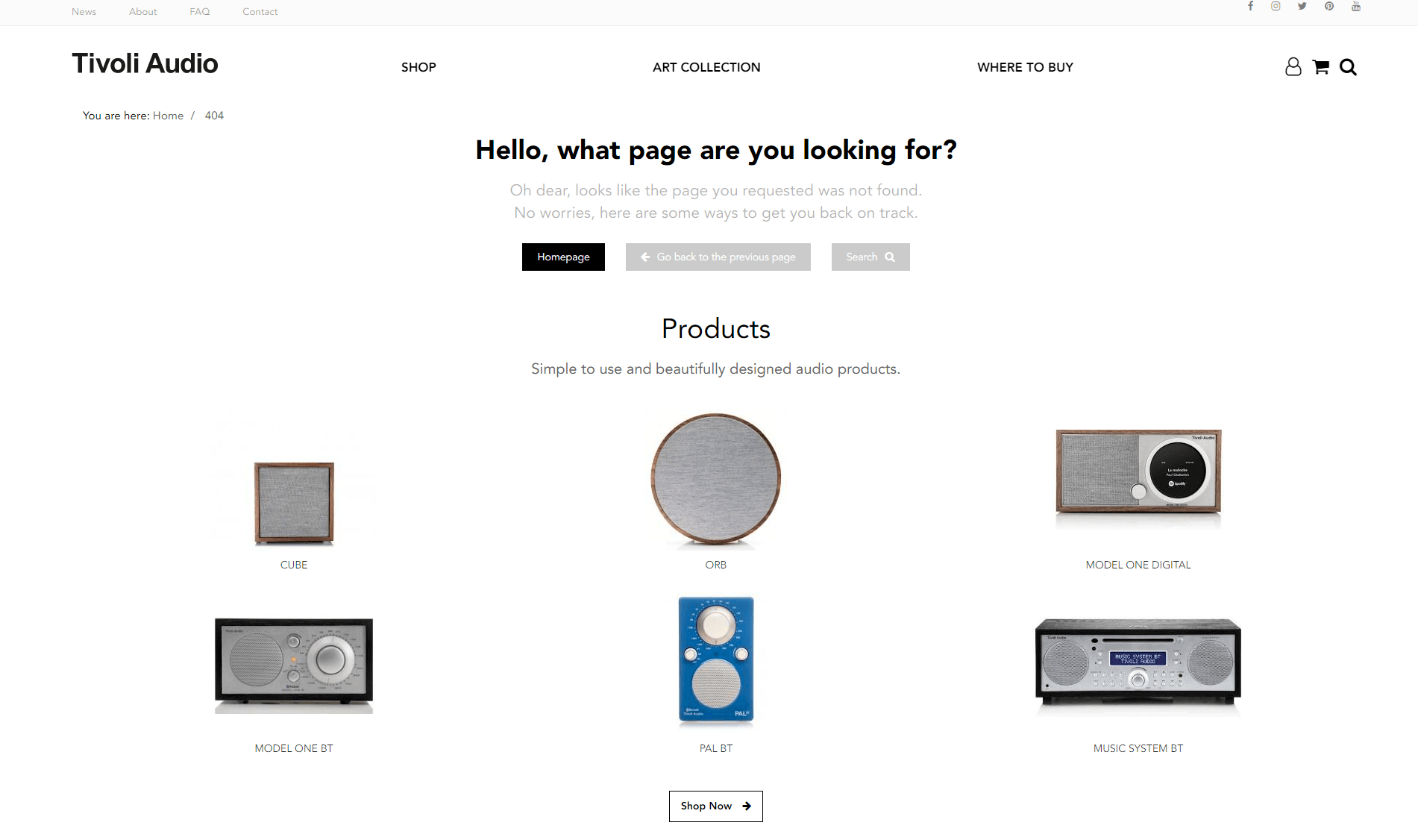
Note the multiple paths provided to the user; they can return home, search with custom key words, or browse related products.
What could have been the end of a user’s web session is now a new opportunity for them to continue perusing.
Internal Linking
You may have noticed that the first hyperlink in this post was to another Digital Ink blog post – this wasn’t a coincidence.
Linking internally helps users find content that isn’t readily accessible from the homepage or menu, and keeps them active on your site.
In general, providing clear navigation through an intuitive menu and thoughtful site architecture will prevent users from getting lost and leaving your site.
Guiding your users through next steps is more of an art than a science. Keep experimenting with different options and suggested paths, and you’ll see a decrease in bounce rate and increase in positive user experience.
About Sarah-Leah Thompson
Digital Ink tells stories for forward-thinking businesses, mission-driven organizations, and marketing and technology agencies in need of a creative and digital partner.
Other Stories You May Like