Designing Your Social Media Presence: Best Practices

Before you start designing content for your brand’s social media channels, you need to make certain considerations.
For example, be sure you’ve done the necessary prep work, including:
- defining your audience
- establishing your goals
- writing and planning your content
Make sure to also consider on which social media platforms you’ll be sharing your content to make sure you’re exporting everything correctly.
Whether your goal is to educate, entertain, or serve as a call-to-action, following these principles will help guide you as you establish your online presence.
Build Brand Identity
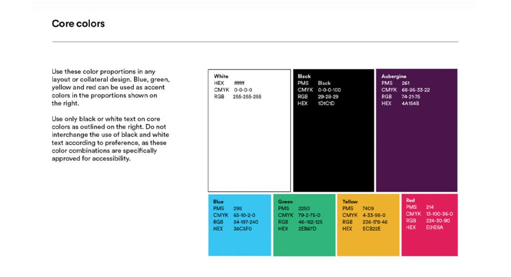
Source: Slack Brand Guidelines
If you’ve spent any time scrolling social media, you know how it feels to be inundated with content.
You want to ensure your posts don’t get missed, and brand identity is an important tool for grabbing the attention of users.
First and foremost, make sure your profile picture is set up with an appropriately sized version of your logo. You can find out required sizes by referencing this handy guide by Sprout Social.
When designing posts, include your logo and use colors and fonts as defined in your brand guide. (If you don’t have a brand guide yet, here’s why you should.) If you’re hoping to have your audience share the content, you should also include the user handle.
Consistently applying these elements will ensure your content is cohesive and helps build brand recognition. This isn’t to say you can’t deviate from time to time, but the majority of posts should be easily recognizable as part of your brand.
Choose Compelling Imagery
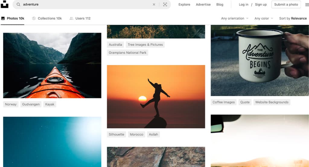
Source: Unsplash
The images you use are an incredibly important component of your overall brand, and you can help contribute to brand recognition by pulling images and/or graphics directly from your website.
If you’re incorporating new imagery, make sure the overall look and feel is aligned with your other collateral. For example, if you usually feature vibrant photos depicting adventure, don’t choose something that’s black and white or feels somber.
If you’re struggling, try writing down three adjectives that describe your brand. When choosing an image, take a moment to decide whether those words apply to the image. (If not, keep searching!)
Proper Hierarchy and Use of Space

Whenever possible, keep the text brief.
Regardless of the ultimate goal, you don’t want to overwhelm your audience. Too many competing elements or a large wall of text will tend to do exactly that.
Instead, make sure you have plenty of white space and use contrast to highlight the important information. You can see in the examples above how text weight, size, and color are all helpful tools in calling attention to certain areas.
Accessibility for All
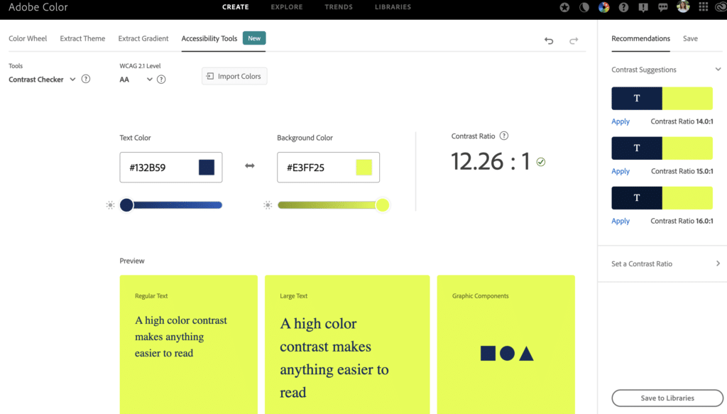
Source: Adobe Color
When designing for social media, you should implement similar accessibility features as when designing for a website.
Opt for sans serif font when possible, and make sure the type is large enough to be legible. You can also utilize a tool like Adobe Color’s Contrast Analyzer to ensure that your color contrast ratio meets accessibility standards.
Lastly, add alt tags for images and captions for videos. These are important considerations that not only increase the visual appeal of your content, but also guarantee inclusivity for those who are hearing or visually impaired.
Consistency is Key
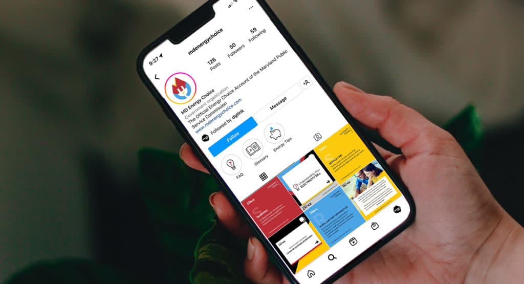
Source: Cassandra Polito / MD Energy Choice Instagram
Aim for consistency across the board with your graphics. Headers and body text should remain the same from post to post, and the logo or user handle should be in the same area.
It’s important to note, however, that while you want consistency, you don’t want every post to use the exact same layout. Being overly repetitive will make your feed appear stagnant.
When we design social graphics for clients, we usually develop a few different templates to use depending on the content type. This not only helps keep things consistent across platforms, but also serves as a guarantee that everything is on brand.
Follow Social Media Design Best Practices
When you’re ready to export your graphics, make sure you’re doing so at the right size.
If you don’t have access to professional design software, you can use a free tool like Canva – just be sure you’re sticking to brand colors/fonts, and don’t get too carried away with their special effects.
If you want help getting started on your social media journey, you can always reach out to us.