Brand Patterns: 5 Examples to Inspire You
In the same way that specific colors and typography become associated with a brand, so can a pattern.
Patterns are a great way to improve brand awareness and reinforce familiarity among users. A pattern may incorporate icons, logos, or other elements to help serve as part of a brand’s visual identity.
Here are 5 examples of where patterns work and how you can apply them to your own brand:
1. Packaging and Apparel
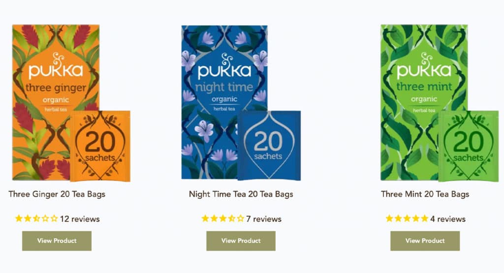
Pukka utilizes patterns across their products to help differentiate flavors/styles. While the specific plants and colors change, the overall structure of the pattern remains the same. The flowing floral pattern is representative of a natural/organic product while also reinforcing the serene mood that comes along with sipping on a hot cup of tea.
Make it work for you: If your organization doesn’t have a physical product, you may consider using a brand pattern on apparel or items such as mugs, notepads, keychains, etc.
2. Environmental
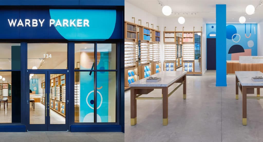
Warby Parker’s brick and mortar stores feature fun illustrated patterns painted on the walls, creating a unique look and experience in each location. Their patterns remain consistent in color and illustration style, making them a recognizable part of the Warby Parker brand.
Make it work for you: If you don’t have a physical office space, you can incorporate your pattern into a fun Zoom background.
3. Business Cards and Stationery
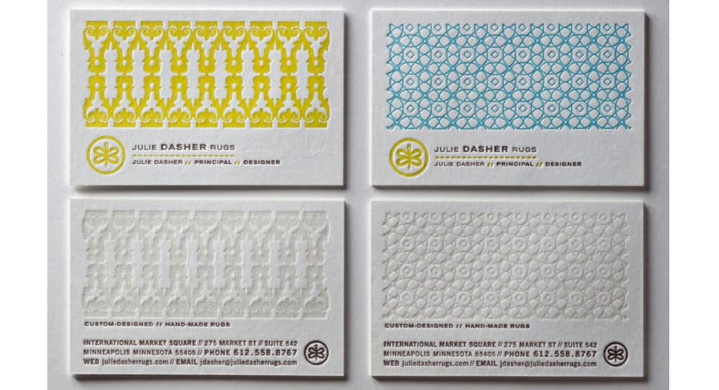
These business cards for a rug designer cleverly incorporate woven patterns that mimic rugs. As an added bonus, they are letterpressed which adds interesting texture to the cards.
Make it work for you: A pattern on your business card or stationery doesn’t always need to be a prominent element – it can also be used as a subtle accent to add visual interest.
4. Shareable Graphics and Social Media
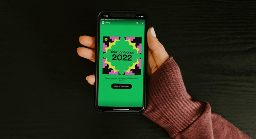
Spotify Wrapped round-ups recently dropped, sending social media abuzz. With a signature pattern of bright geometric shapes in the background, the viral stats graphics are curated for each user and made easily shareable. With the click of a button, users are able to share the branded content with friends and family.
Make it work for you: Consider making content that relates to your organization into something shareable. Infographics or fun facts are always a good option.
5. Presentations
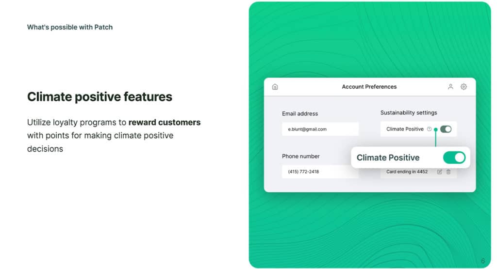
A great way to add flair to your PowerPoint deck is to include a pattern. Patch is a platform that pitches itself as “facilitating the relationship between companies looking to take meaningful climate action, and the project partners on the ground creating real change.” In the slide deck above, a topographic-like pattern is used as a backdrop for imagery, both mimicking the imagery used on their website and reinforcing the environmental focus of the organization.
Make it work for you: If presentations aren’t a big part of your work, consider other collateral such as brochures, flyers, and postcards.
Remember that a pattern should reinforce your branding and help tell your story, so it needs to align with your brand’s mission and voice. If you think you might benefit from designing a branded pattern, we can help! Reach out to us.