New Year, New Mobile Experience?

It’s the start of a new year, and resolutions are top of mind.
As an organization, one of your goals might be to re-evaluate your site’s mobile user experience. (And if not, it should be!) We’ve written before about some mobile UX fundamentals, including best practices for navigation design, text and button sizes, imagery, and functionality.
If you’ve already covered the basics, take things a step further to ensure your site is not only functional, but also enjoyable.
Here are some usability considerations that can help increase user satisfaction.
Simplify Content for Easier Scanning and Comprehension
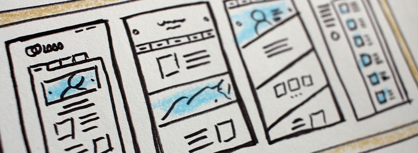
Content should be as brief as possible.
User comprehension is even worse on mobile than on desktop – and it makes sense. People are viewing the site on a much smaller screen, without a keyboard or mouse, and sometimes they’re accessing it while on the go.
All of these factors increase the chances for frustration, so user experience is especially important to consider here. Minimizing copy and hiding cumbersome graphics or animations when necessary will help to increase comprehension by making content more scannable, with important information easy to find.
Incorporate Tools to Help Organize Information

Where copy cannot be pared down, implement tools to help users navigate through content.
For example, a table of contents can help users jump to relevant areas of longer form content such as articles or blog posts.
For other content-heavy pages, like services or programs, expanders and tabs can organize information and condense it into easily accessible sections. Implementing filtering on search results, including news or blog pages, will help users narrow their results and find exactly what they’re looking for.
Help Direct Users to Next Steps

If there are parts of your site where users tend to get lost on desktop, the problem will be twofold on mobile. That’s why it’s crucial to help direct users at the end of each page with a relevant call-to-action.
Occasionally, an outdated link is clicked or an incorrect URL is entered and users may end up on a 404 page. Ensuring the page is designed to best support and direct your users is crucial. The design will depend on what makes sense for your site, but a few helpful elements to consider including are:
- Search function
- Links to popular pages
- Contact information
Directing users to the next logical step helps keep them on track, and limits the chances of them leaving the site in frustration.
Whether you find that your site needs a few tweaks to improve or are considering a full redesign, we can help you reach your goals.