Review: Washington Nationals + Wizards Cherry Blossom Uniforms
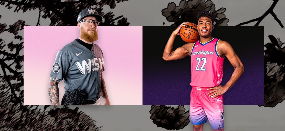
Washington D.C.’s baseball and basketball teams, the Washington Nationals and Washington Wizards, recently revealed new uniform designs, inspired by D.C.’s iconic cherry blossoms.
The announcements were timed appropriately with the cherry blossoms being in full bloom.
Cherry Blossoms and Washington D.C.
While there are some species of cherry native to North America, D.C.’s cherry trees are not native to the region.
They were planted in 1912 as a gift of friendship to the people of the United States from the people of Japan, where the flowering cherry tree, or “Sakura,” has long symbolized birth and death, as well as the impermanent nature of life.
Since then, they’ve become an important part of the visual iconography of D.C., along with the Washington Monument, the Capitol Building, the National Zoo pandas, and the Cool Disco Dan tag. So it makes a lot of sense for the Nationals and Wizards to adopt cherry blossoms as a way to connect with the city.
The Washington Wizards City Edition Uniforms
Every year, Nike and each NBA club work together to design a new uniform intended to connect each team to their city and community.
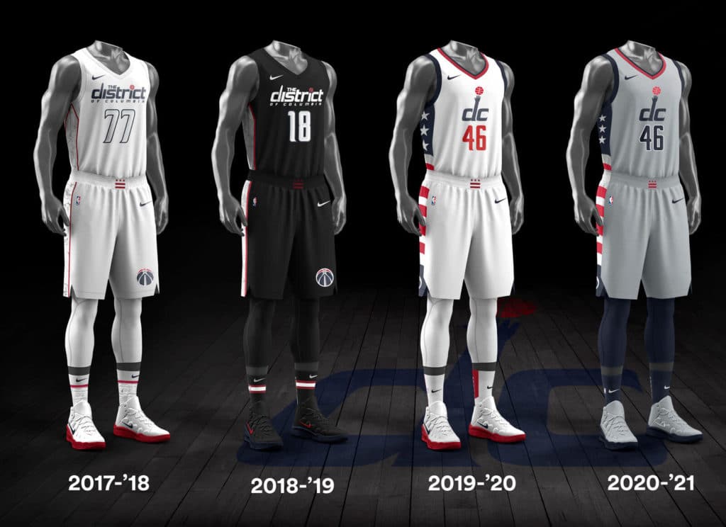
The Washington Wizards previous City Edition uniform designs
Since 2017, the Washington Wizards have had four city edition uniforms. They have all been somewhat drab and uninspired, sporting a mostly neutral overall palette with red accents inspired by or directly referencing the US and DC flags.
The logos and wording on all four uniforms are references to their past, and also include small references to the Washington Monument.
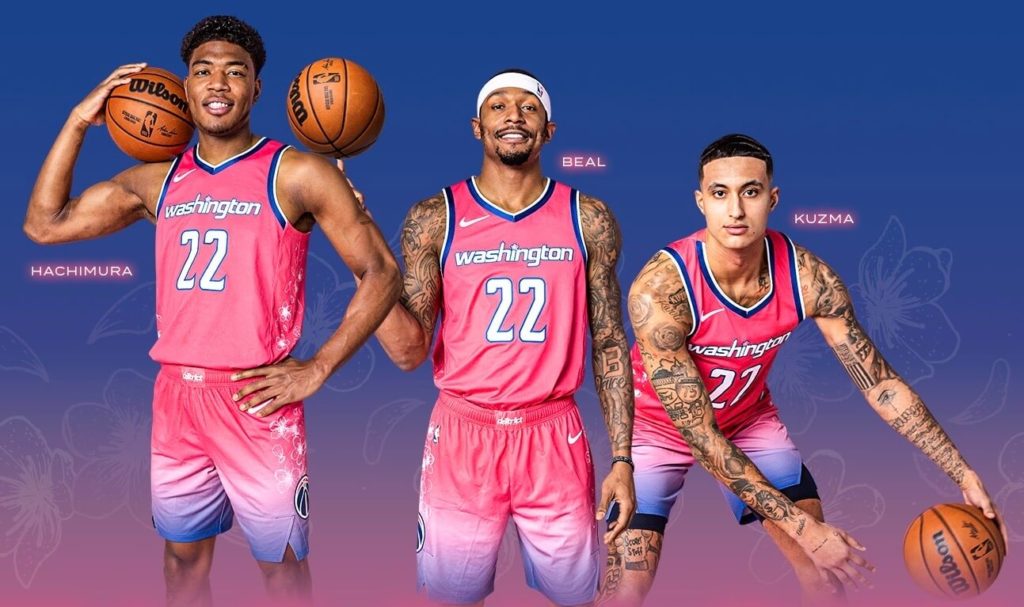
Their new cherry blossom jerseys are the exact opposite. As our graphic designer and resident Wizards fan Gina Armstrong puts it:
“I think it’s a fun, fresh take on the city edition jersey that fans have wanted for a while. I appreciate that they stepped outside of typical wizards colors and fully went for it.”
They finally ditched the gray for a cherry pink gradient that is reminiscent of a sunset along the tidal basin, and the dark trim along the bottom of the shorts really makes it stand out.
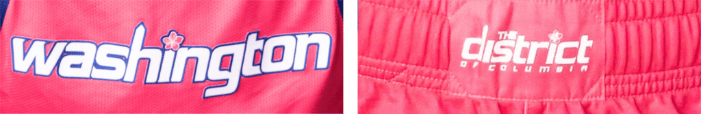
They linked the new look with elements of their core branding and previous city designs by including the Washington Monument in their primary word mark, as well as in the secondary word mark on the shorts. They’ve also cleverly incorporated a cherry blossom in both, using it in place of the dot above the “I” in both marks.
It’s a nice added detail, albeit difficult to discern from a distance.
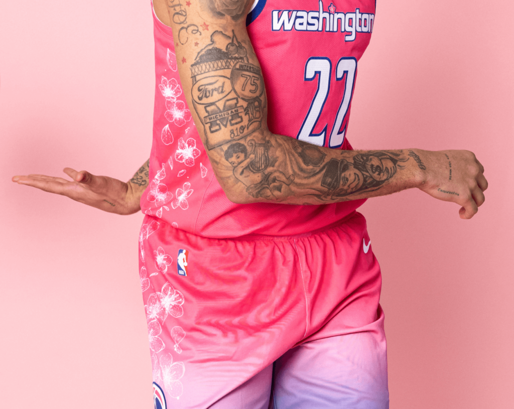
To top it all off, the falling cherry leaves on the sides reinforce the motif and add a graceful sense of movement.
Some Wizards players are already inspired by the new uniform. Japanese-born Power Forward Rui Hachimura recently unveiled a pair of cherry blossom inspired Air Jordans and kimono.
FIRST LOOK: Rui Hachimura’s “Cherry Blossom” Air Jordan 35 PE, celebrating his Japanese heritage and Washington’s annual festival. pic.twitter.com/fCxvAfRVGz
— Nick DePaula (@NickDePaula) March 21, 2021
Black Samurai – My Soul. My Roots. My Culture. My Pride. pic.twitter.com/4XuDZK6Ld8
— Rui “Louis” Hachimura 八村 塁 (@rui_8mura) March 22, 2021
There’s time for the Wizards to tweak the new city uniforms to look more like Rui’s kimono. They won’t play in them until the 2022-2023 season.
The Washington Nationals City Connect Uniforms
Major League Baseball has always been a game of traditions, and doesn’t have as rich a variety of uniform sets for each club in the way the NBA does (with some exceptions).
That has been changing slowly, ever since Nike won the rights to produce each team’s uniforms.
During the 2021 season, Nike and MLB unveiled their City Connect jerseys. Just like the NBA’s city edition uniforms, the City Connect jerseys are intended to express the personality of the home city in which each team plays.
This year’s cherry blossom inspired uniform is the National’s first entry in the City Connect line.
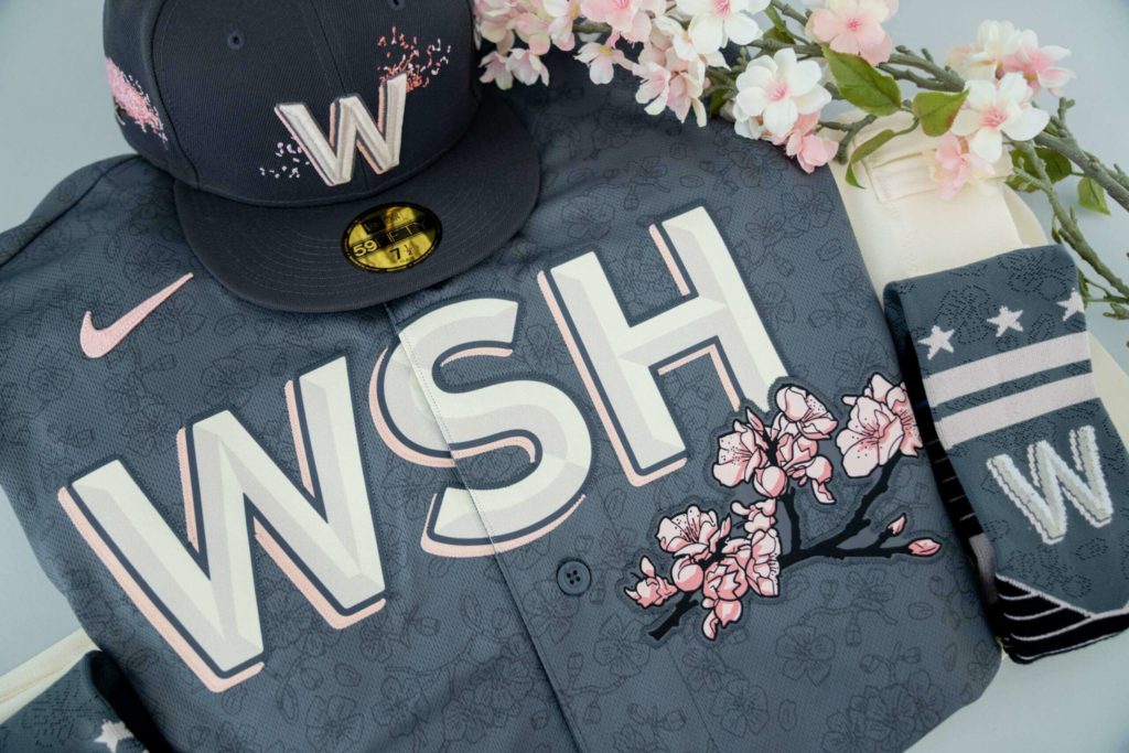
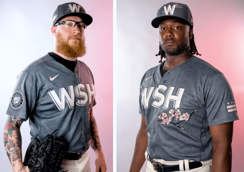
I’m glad that they didn’t feel beholden to the curly Walgreens W primary logo on the hat, which has always bugged me.
The illustrated elements – including the pattern on the shirt and socks, the flowers below the crest, and on below the W mark on the hat – bring to mind the beautiful tradition of Japanese print-making.
I’m not as excited about the crest on the jersey. I think there is usually a more clever solution out there than using what is basically an airport code. However, it is bold, and the pink drop-shadow adds another graphic, pop-art touch to the overall aesthetic.
I also like that they felt free to alter the color palette of their shoulder badge logo, as well as the D.C. flag on the opposite shoulder. I think if they had used their usual colors, it would have clashed with the rest of the design.
The gray base color on the top and socks is probably the most controversial aspect of the design. You could argue that the dark of the gray doesn’t capture the feeling of newness and rebirth that we associate with spring time and blossoming flowers, and that a lighter tone might have been a more effective choice.
However, the dark gray achieves two objectives.
First, the darker tone adds needed contrast to make the pink blossoms stand out, and also reminds me of the bark of a cherry tree. Second, when you picture certain parts of DC, you see concrete. Lots of it. From the brutalist federal buildings to the Metro stations, there is a lot of gray in DC. In that way, the gray on the uniform creates a visual link to the city.
Overall, as with the Wizards, I admire their willingness to eschew tried-and-true tradition to create something new and exciting. Just ditch the airport codes next time.
The Branding Goals Tell the Story
Unlike the recent Washington Commanders rebranding, the Wizards and Nationals Cherry Blossom-inspired uniforms are a good of example of stepping outside of your comfort zone and trying something new to accomplish branding goals.
There’s no substantive difference in the branding of a uniform, a business card, or a website. The goal is to tell a story in a way that is meaningful to your audience.
Do you need help telling your brand story? Let’s talk!