Happy Halloween: My Favorite Spooky Logos
I may not be the biggest fan of haunted houses or scary movies, but I still to consider Halloween one of the funnest holidays to celebrate. Every year, I look forward to seeing how creative people get with their costumes and I love seeing all the cool pumpkin carvings and decorations put out on display.
Since being spooked is half the fun, here are my all time favorite frightful and spooky logos to help you get into the Halloween spirit.
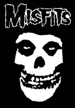
This especially menacing logo belongs to the Misfits, an American punk band formed in 1977. Known for their use of horror film themes and imagery, the cover of their single “Horror Business” featured a skeletal figure inspired by the main ghoul of the 1946 film The Crimson Ghost.
The skeletal figure became the band’s mascot and the skull would serve as the band’s logo for the rest of their career. Since high school, spotting this iconic skull has been somewhat of my own personal game of Where’s Waldo. I can’t help but get excited when I catch a glimpse of the eerie and goofy grin of this logo.
What I like so much about the band’s logo is how well it matches the feel of the band. The mask like quality of the smiling skull plus the scratchy scribbled letters just all scream horror movie to me. Instead of looking sloppy, the unsteady lines of the logo gives me the creeps.
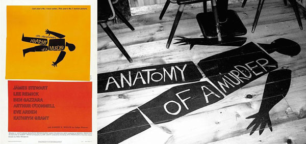
Anatomy of a Murder is a 1959 courtroom crime drama directed by Otto Preminger and is often described as one of the finest pure trial movies ever made. The morbid logo for this film was created by legendary graphic artist Saul Bass.
With notable work done in corporate logos and identities, Saul is known best for his design of motion picture title sequences and kinetic type. The opening to the AMC hit series Mad Men pays homage to Bass by purposely emulating the animated graphic style that made him famous. The jagged cut and paste minimalistic style and off-kilter typography is what I love about this ominous logo.
By jarringly dissecting the silhouette of a corpse into seven pieces, Saul captures the moral ambiguities of the movie while making a clever visual pun with the film’s title.
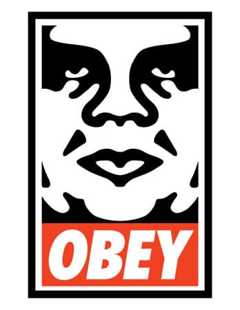
What started out as an absurd inside joke among friends has since evolved into a worldwide street art campaign and popular clothing line. In 1989, while attending Rhode Island School of Design, Shepard Fairey created paper and vinyl stickers with an image of the wrestler André the Giant paired with the text “André the Giant has a Posse 7’ 4”, 520lb.”
Shepard and the skater community covertly and franticly posted the stickers all over the east coast, however a lawsuit threat from Titan Sports, Inc. caused him to stop using André’s trademark name. Pairing the anti-authoritarian slogan “OBEY,” Fairey reworked the single color portrait of the wrestler’s haunting glare making the current logo known today.
Though this logo isn’t intended to be particularly spooky, the hostile mug donned by the massive wrestler is a bit menacing. And while what I like most about this logo are the smooth symmetrical shapes, their resemblance to an inkblot test seems to question my sanity.

