A Wordle of Advice – Learning from the Viral Game
Unless you’ve been living under a rock lately (no judgement if you have), then you’ve probably heard about Wordle, the viral word guessing game, created by Josh Wardle.
At Digital Ink, we’ve been plagued with Wordle-fever. Gone are the days of starting the morning with a warm “hello” on our Slack channel. Instead, the all-too-familiar green and yellow emoji squares kickstart each new day.
Being the website design and development nerds that we are, we’ve still managed to find opportunities to make Wordle relevant to our actual jobs.
That’s right — we’ve analyzed Wordle’s user experience to discover what it’s doing right and you can apply it to your website or game.
You’re welcome.
Everything Wordle is Doing Right
Onboarding
Right off the bat, visitors that are new to Wordle are greeted with a brief “How to Play” guide. If your website has any features that are not necessarily intuitive, having an onboarding process can be very helpful for new users.
Wordle’s onboarding process only pops up the first time you visit the site, to avoid annoying users unnecessarily.
Should anyone ever need a refreshed on how to play, there’s a “?” icon in the top left corner that pulls the guide back up.
Visual Cues
When designing a website, color is an excellent tool for creating a visual hierarchy and guide for navigating a page.
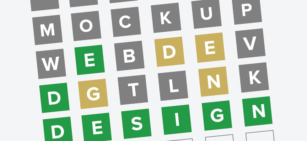
When you guess a word in Wordle, the colors of the letters you guessed change based on whether they’re in the word and where they are in the word. It’s a simple mechanic presented through a minimalist color scheme, but it’s super effective.
Wordle’s creator took this visual information a step further by also changing the colors of the letters on the keyboard section, to help players remember which letters they’ve already guessed.
This attention to detail mitigates the potential stress a user could experience by having to constantly confirm that they haven’t already guessed certain letters
Wordle meme by Michael J. Seidlinger via Twitter
White Space
The layout of Wordle’s interface is extremely simple. There’s a top navigation menu, a 5×6 grid, and a keyboard. The rest of the page is entirely white. To some, so much white space may seem empty, or a missed opportunity to include more information such as ads or enticing links.
On the contrary: white space is essential. It allows the important content to be the center of attention, and generally makes it easier for the viewer to take in the information without being overwhelmed.
When designing your website, please make sure to include enough white space to let your content shine through. And remember, your logo does not have to be the center of attention.
User-First Content
The creator of Wordle could have taken the easy route and simply compiled a list of every 5-letter word in the English dictionary and randomized them. But he didn’t want users frustrated by outdated or niche words that they had never heard of before.
So, he and his partner manually filtered 13,000+ words down to a core list of 2,500 common 5-letter words. An impressive and appreciated feat.
From this we can learn that it’s incredibly important to take the time to edit your content down and make sure that whatever remains is genuinely relevant to your users, lest they get frustrated or bored and move on to something else.
Prominent Call to Action
When you finally guess the Wordle (huzzah!), a window pops up presenting you with three pieces of information:
- A breakdown of your personal performance statistics
- When the next Wordle will be available (since there’s only one word each day)
- And a big “SHARE” button
The user is left with clear instructions about when to check back in order to play again, and how to share their score with their network.
The “Share” button also has the added benefit of being an elegant lure to acquire new players, while simultaneously bringing existing players closer together. The post-game window is simple, elegant, and leaves no question unanswered.
Remember, you are not your users. The information that you want to present is not necessarily the information your users are looking for when they come to your website.
When designing your website, it’s important to put yourself in your users’ shoes and identify what information they would be looking for. Once you have an idea, make sure it’s easy for them to locate that information and accomplish their goals.
Accessibility
Wordle offers a basic color blind mode, featuring higher contrast colors. While this is a great starting point, there is still more that can be done to meet accessibility standards.
Some fans have created their own extensions to run while playing Wordle that support screen-readers, which would be great for Wordle to integrate.
Other have created an accessible version of Wordle results that make it easier for screen-readers on social media to communicate your score.
The next time you play Wordle, I hope you take a minute to appreciate the user experience, and enjoy it!