Trend It or End It? Making Website Design Decisions
Website design trends are in a constant state of flux as technology and aesthetic preferences evolve. Designers observe trends as they come up and then adapt their design decisions to stay ahead of the curve.
In order to help separate the wheat from the chaff, here’s some trends that we’re seeing, how we’re incorporating them (trend it), or if we’re moving on from it (end it).
Big Hero Images
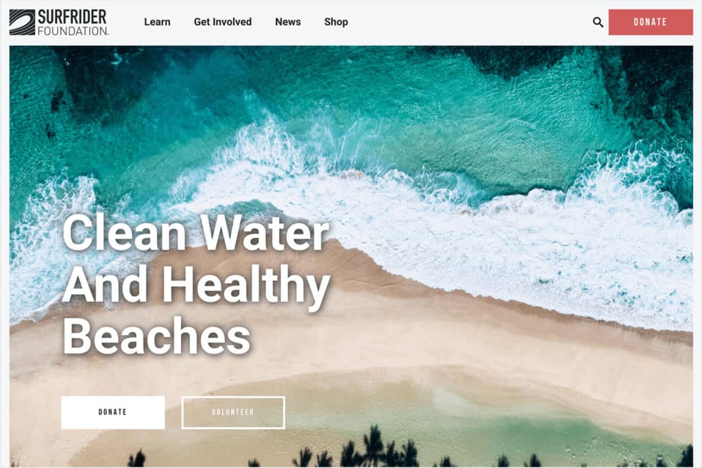
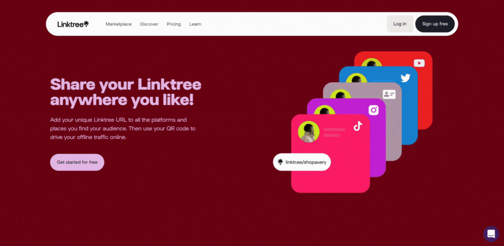
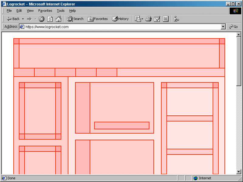
Screenshot via justinmind.com
Big hero images refer to the large, fullscreen image usually at the top of a website’s homepage.
A massive image as the first thing you see on site can certainly make a bold branding statement. But it comes with a lot of trade-offs.
The biggest trade-off is that it pushes important content further down on the page, making it less likely that visitors will see it. Being constrained to one spot for a big image also makes the design overly reliant on having the perfect image.
I can say from experience that finding that picture-perfect image is a big obstacle for many organizations.
Additionally, having a site with a lot of big, high-resolution hero images can significantly slow your website speed and load times.
Verdict: End It.
Broken Grids
Over the last decade, web development technology has evolved to a point that allows for a wide variety of layout possibilities.
Back in the 90’s and 00’s, everything was previously built using tables, and wasn’t responsive to different screen sizes. That limitation eventually gave way to responsive design, which still relies on a grid system. With the grid system, a lot of website designs use a pretty simple column-based layout.
In contrast, a broken grid allows for more visual intrigue driven by content, which makes for much more compelling storytelling.
Verdict: Trend It.
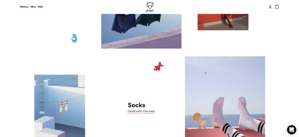
Memphis Design
Screenshot via webflow.com
Memphis Design is a design aesthetic that was pioneered in the 80’s by an Italian design and architecture group.
It uses vibrant colors, patterns, geometric shapes, and often features depictions of people or objects with exaggerated, cartoonish features. Think Pee-Wee’s Playhouse, or early Nickelodeon.
In the website design industry, it became popular as a reaction to the wide-spread cookie cutter templates, which were seen as devoid of personality. Today, Memphis Design has become ubiquitous again as an easy way to inject fun and character into a website. Time is a flat circle.
A big part of successful design is finding new, unique ways to solve problems. Because of it’s cultural saturation, there’s not much new left to do with Memphis Design.
Verdict: End It.
Engaging Interactions and Scrolling Effects
Advances in graphics for the web like SVG files and CSS animation have increasingly made static designs a thing of the past.
Website designers are incorporating more motion graphics into their sites, along with interactive scrolling effects that encourage clicking and dragging. A fun website hooks users and makes for more dynamic storytelling.
The future of website design is an arms race of engaging interaction.
Verdict: Trend It.
Brutalism
Brutalism is a philosophy based on stripping everything down to only its most essential components.
It is a reaction to overly busy and ornate designs. In architecture, it manifests as blocky, poured concrete buildings.
Brutalist website design is similar. The designs are stark and usually consist of simple blocks of content. Their simplicity can make them easy for users to scan, and can speed up load times.
They stand in contrast to websites with overwhelming amounts of of animations and scrolling effects, which can help differentiate your brand.
Verdict: Trend It.
Flat Design
YouTube screenshot via LogicLounge
Flat Design is a web design aesthetic that began in the late 2000’s and early 2010’s.
It was a reaction to the skeuomorphic effects seen in things such as early iPhone app icon design, and was probably most famously used by Microsoft Windows Metro.
In website design, it became heavily adopted as an aesthetic that differentiated itself from everything else at the time. Aside from it’s over-saturated sameness, its biggest flaw is with accessibility.
Flat Design makes it hard to tell what is important and what is interactive due to everything blending together visually.
Verdict: End It.
Layering
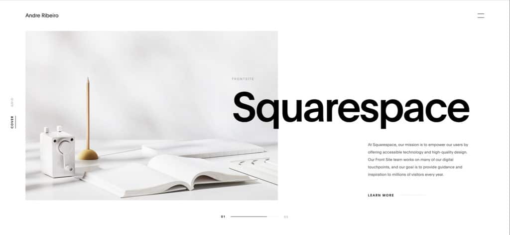
Screenshot via bashooka.com
Layering is all about creating a visually interesting design with depth.
It is the antithesis of Flat Design.
Depth helps clarify what is important in a layout.
The most effective website designs combine interesting, layered grids with engaging interactions.
Verdict: Trend It.
Let’s Talk Trends.
These are just some of the most common trends that we see, and it can be difficult to know which trends are worth following and which should be left in the dustbin of history.
We’re here to use our experience to help you determine which is the right choice for your website design.
