Popular Website Design Mistakes and How to Fix Them

As designers and marketers, we tend to focus our attention on – and draw inspiration from – websites with great designs.
But occasionally, we’ll take a look around the Internet for websites with bad design in order to avoid making those same mistakes.
Bad design mistakes don’t always mean using fonts like Comic Sans, low-res images, terrible stock photos, and tacky colors. Those things are subjective.
The kind of mistakes we’re talking about are those that actively inhibit the website from doing what it was intended to do.
Let’s take a look at seven websites that do just that.
Zara: Menu Placement and Above-the-Fold Content
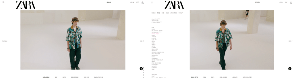
Screenshots from Zara’s website
Looking at Zara’s website, you might not even know they are a fast fashion retailer.
Right off the bat, one questionable design element is that the main menu is in the top left, rather than the top right, of the screen. Click rates for hamburger menus in the top left are low because that’s is not a core section of the screen, like the center, where your eyes naturally look first.
The menu items are hidden behind a hamburger menu, and when navigation is hidden, users are less likely to explore.
Additionally, a majority of the precious above-the-fold real estate is a carousel with minimal labeling that moves too quickly and has no clear goal. Carousels are rarely built with the user in mind, and are usually a half-baked attempt to cram too much information into a section. That’s why we don’t recommend using carousels on your website.
At the end of the day, an e-commerce website needs to clearly show what’s for sale and make it quick and easy to buy those things.
Here’s what we would recommend Zara do differently:
- Make parent categories more prominent by taking them out of the hamburger menu
- Use a traditional, centered navigation design and create a more prominent search bar
- Use the space above-the-fold to promote important products in a more effective way that also bolsters the brand
Reddit: Low Information Density
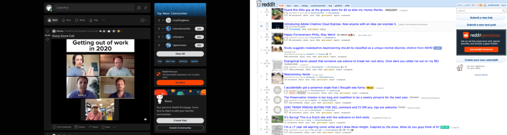
Screenshot from Reddit’s website
Reddit’s website suffers from a case of low information density. It used to be that you could get a lot of information from looking at a glance.
While the current design is a little cleaner, there are rarely more than 2 stories above the fold, even at larger screen sizes. Thus, it takes too long to find something interesting.
Reddit eventually made their old design available again for long-time users who got frustrated with the current design.
To find a happy medium between new and old, we would recommend giving less real estate to individual posts, while avoiding analysis paralysis generated from information overload.
Pinterest: Properly Labeling Content
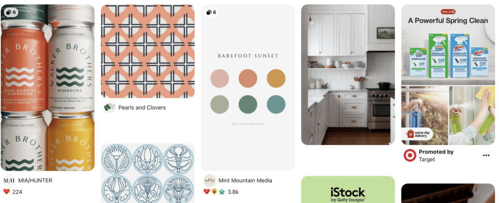
Screenshot from Pinterest’s website
The design mistake that Pinterest makes isn’t big, but if it irks me, it’s bound to be troublesome to others.
Their website design does both a poor job of labeling promoted content and including too much of said promoted content in search results.
Promoted posts are differentiated by a small line of text below each image tile’s title that says ‘Promoted by’, which stylistically looks very similar to the title text. When you scan through tiles quickly, you often click on tiles without realizing that you are clicking on an ad.
As a result, it feels like Pinterest is tricking its users into clicking ads, which lowers trust and creates a bad user experience.
Pinterest could remedy this design mistake by modifying the promoted labels:
- Make the labels more visually separate and distinct from each other via margin, padding, and other forms of white space
- Make the labels more stylistically distinct from other nearby text via size, color, and font style
Doing so would make it more clear which tiles are organic and which are promoted, which would lead to a more transparent user experience.
Facebook: Broken Links Throughout the User Journey
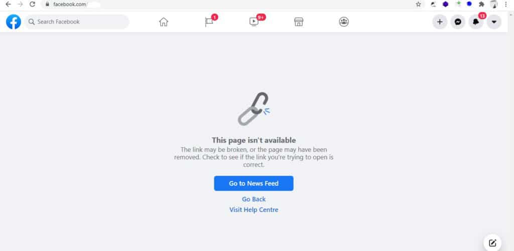
Screenshot from Facebook
It might be a little strange to accuse a billion dollar social media platform with an army of designers, developers, and testers of making significant website design mistakes.
But Facebook has been frustrating us for months while they transition to a new business account management interface and brand.
The transition has resulted in a number of broken links, or links that take you on a wild goose chase to find something that loops you around and never gets you where you need to go.
They could fix their consistency issue by making sure their links work and establishing a clear user journey.
Changing too much on a website too quickly often causes confusion. Incremental change can be the best course of action, in order to better guide your users and ensure a consistent and smooth transition.
NBC Sports Philadelphia: Distracting and Intrusive Advertising
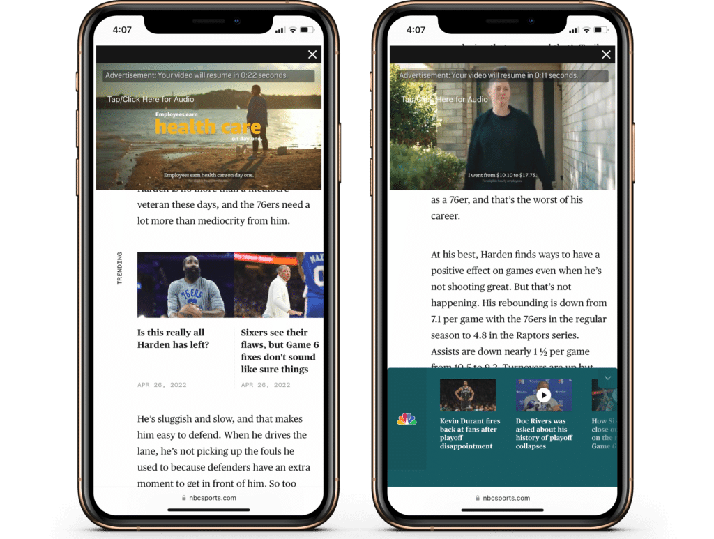
Mobile layout from the NBC Sports Philadelphia website
As a Philadelphia-area resident and a Sixers fan, I’m frequently subjected to the design mistakes on the NBC Sports Philadelphia website.
At first blush, it looks like a nicely-designed sports media site. However, the mistakes become glaring once you try to actually read one of their articles.
There are constant ads and video pop-ups that take up the entire screen. It is distinctly not a mobile-friendly design, and antagonizes users. In fact, Google penalizes the search ranking results for websites that have too many pop ups or “intrusive interstitials.”
NBC Sports Philadelphia could resolve this issue by simply having fewer pop ups, or rethink how they embed related videos and other media within the body of their posts.
A few other solutions to improve the mobile user experience with pop ups are:
- Use device-specific display rules
- Show non-obtrusive popups
- Exclude return visitors from popups
Booksy: Finding the Specific Provider You Want
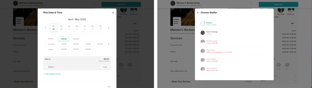
Screenshot from Booksy website
Booksy is a free beauty scheduling app that purports to make it easy to find and schedule appointments with local hairstylists, massage therapists, nail salons, etc.
Unfortunately, the most critical part of their website – their calendar – features a pretty substantial design mistake.
Booking with your preferred stylist is extremely difficult, if not impossible, with the current design.
The first choice is to hit the ‘book’ button next to the service you want. Next, a pop up overlay shows the upcoming seven days in chronological order, and gives you a choice to book with whomever is available that day.
If your stylist isn’t available that day, you have to hunt through each day and hope they have availability on that day. It is exhausting.
A better design would present a full list of days in each month, with times for every stylist available that day. Or better yet, make it much easier to only search availability for the stylist you want.
Allowing users to select from a list, rather than input the information manually, saves them time and effort and improves the overall user experience.
Yale School of Art: Everything
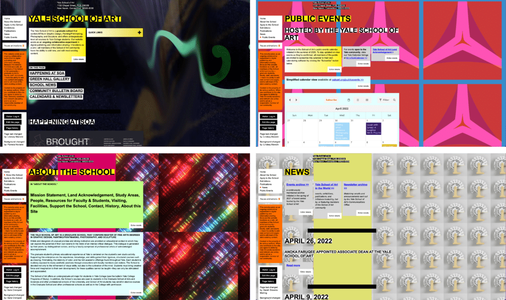
Screenshots from the Yale School of Art website
Where do we even begin with the Yale School of Art website?
Pretty much everything about this website is a mistake.
It is a collaboratively-run website, which means all members of the School of Art can add new content and pages, and edit most of the site’s existing content. That isn’t necessarily a bad thing, but it makes for a chaotic design which leads to it look like a website from the early Internet.
It is incredibly difficult to navigate. The main menu is tucked away in a little gray box in the corner, while other important links are hidden behind a “quick links” dropdown. Nothing is where you would expect it to be on a more modern site.
There is no visual hierarchy. You can’t tell what’s a header, what’s a button, what’s important and what isn’t.
This website’s design is obviously intentionally unconventional, but for what purpose? A good website design should first and foremost be built for your audience.
Based on this website design, I can only assume their audience is whoever designed the Space Jam website.
If this list inspired you to fix potential design issues on your website, reach out to us — we’re happy to help make that happen.