Tools We Use: Color Palettes

Creating a color palette from scratch may seem as simple as choosing colors that you like – but in reality, it requires plenty of design considerations.
Just as your font choices send messages about your brand’s personality, so do your colors. Building a color palette requires a solid understanding of your brand archetype, as well as the impact colors can have on emotion (also known as color psychology).
You’ll also want to consider how the colors will be applied; for example, will they be used for text, background colors, or design elements? Knowing this allows you to check for any potential contrast issues and ensure that the site is accessible.
When it comes to building a harmonious palette, here are three tools we enjoy using.
1. Coolors

source: Coolors.co
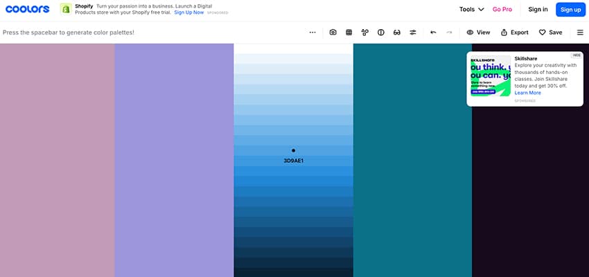
Coolors is a color generator that allows you to sift through endless options.
It has a full screen view of the colors, making it helpful for evaluating the harmony of a particular color scheme. When you find colors that you like, you can lock those in while you continue to explore other hues for the remainder of the palette.
You can also adjust the specific shade of each color, customizing the palette for contrast.
2. Adobe Color

source: color.adobe.com/create/color-wheel
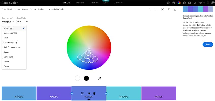
On Adobe’s color tool, you can select the type of palette you want to create and adjust individual hues from there.
Color also allows you to upload a photo and extract a palette directly from the image. They even have their own contrast tool built into the site, so you can immediately check the contrast ratio of your new palette.
3. Canva

source: canva.com/colors/color-palette-generator/
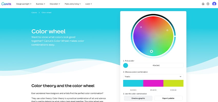
On Canva’s color palette generator, you can browse existing palettes, create your own from an image, or select specific colors.
As an added feature, once you’ve created a palette, you can click directly on “create a graphic” and jump right into designing social graphics, banners, and other collateral.
Putting together a color palette for your brand is more than just selecting pretty colors – it requires making thoughtful decisions about how your site will be perceived. Using these tools, we’re able to explore options visually and test color combinations for functionality.
If you have questions about your color palette, we can help. Reach out to us!

