Beautiful Websites I Didn’t Design
by Jason Forrest
Insights / Website Design /
As a designer, I am constantly confronted with the reality that no matter how good I think my designs are, there is always someone doing things light years ahead of where I am at. Rather than let it become a source of frustration, I choose to use their work as a source of inspiration to constantly better my own designs.
What makes a website beautiful? This is obviously a very subjective question. I think there are at least three major criteria a website has to have for it to be considered beautiful:
- It needs to be aesthetically pleasing and easy to use. If a website looks pretty but is a nightmare to use, what is the point?
- It has to be engaging. If it doesn’t make you want to keep coming back for more, it probably isn’t that beautiful.
- It should be unique. This isn’t necessarily a must, but it definitely helps.
So with our criteria in mind, and a willingness to be humble, lets take a look at some beautiful websites I didn’t design.
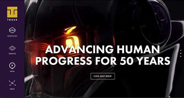
Trask Industries
As a designer and HUGE comic book nerd, this site is basically made for me. To put it another way, I am the venn diagram. Trask Industries is a teaser site made for the upcoming film X-Men: Days of Future Past. It’s a fake site for the laboratories of Bolivar Trask, a scientist who sees mutants as an existential threat to humankind.
But what makes it beautiful? Just look at it. Big cool images, tons of interactive icons and graphics, a simple but well thought out color palette that lets the content shine, and an easy to use interface that gives you a lot of information about the laboratory while still making you want to learn more (and if you’re me, dishing out $20 to see the movie in 3D.)
Runner-up: The Bent Bullet (another teaser site for Days of Future Past)
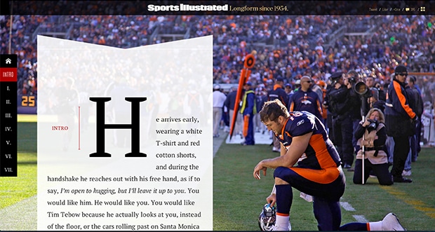
The Book of Tebow
Sports Illustrated has done a truly admirable job of translating the look of their iconic magazine into a long form magazine site for The Book of Tebow. As a matter of fact, this site is much more visually interesting than their print magazine.
Aside from the elegant and classical typography, my favorite thing about this site is how the copy moves in relation to the images as you scroll down. You might think that it isn’t anything too unique until you get to chapter four. The way the images of other failed Heisman winners swoop in to the center, the way they feature covers that Tebow was on, even the way they include annotations just before image breaks.
It all amounts to something more than a magazine, and the combination is mesmerizing.
The designers managed to do so many impressive things with something that could easily just be a really long blog post, and I for one will strive to always think outside of the box as they have with this beautiful website.
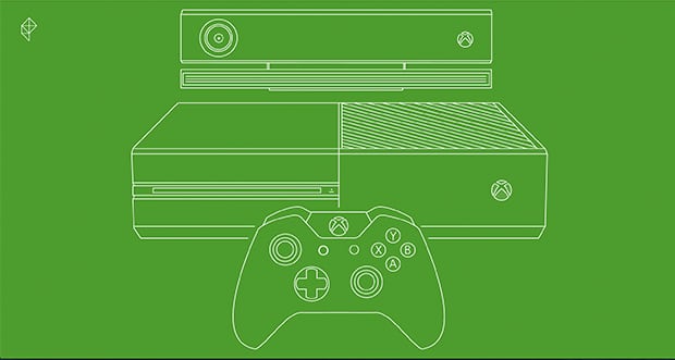
Polygon’s Review of the Xbox One
I realize that we have sung the praises of the great work that Polygon is doing right now, but it demands a bit more praise. Their review of the Xbox One is so beautiful that it speaks for itself (but I’ll speak for it too).
When you land on the site and see the super cool wireframe illustration of the Xbox that draws itself, then shrinks to reveal the start of the article, you know you are going to be in for something special.
They gave everything about a normal blog post a unique treatment. For instance, while you could simply do an image that shows a screenshot of the product, they use animated gifs that show how the thing works. Instead of a side-by-side static image of the products, they use an interactive sliding before and after tool.
Instead of standard photographs of the product, they repeat their use of animated schematic illustrations. And they treat little things like advertisements in such a clever way by hiding them until you scroll over to reveal them, which makes you love seeing them. Essentially they took everything you might expect and cranked it up to eleven.
These Websites are Beautiful … So What?
We all need something to aspire to, including myself. Looking at sites like these and breaking down what makes them special is how we up our design game (and humility aside, we’ve got game). We also love a challenge and never shy away from a little competition.
Do you know of some beautiful websites that we didn’t mention? Do you have a site that isn’t as beautiful as you’d like it to be and need some help? Contact us – our operators are standing by.
About Jason Forrest
Digital Ink tells stories for forward-thinking businesses, mission-driven organizations, and marketing and technology agencies in need of a creative and digital partner.
Other Stories You May Like