5 Examples of Excellent Mobile Web Design

Nearly everyone has some sort of mobile device and many keep their phones with them at all times. With 55% of all web traffic coming through mobile phones as opposed to laptops, understanding how to create a user-friendly mobile web design is crucial.
But how do you make a user-friendly and mobile-friendly website? Here are three important best practices to consider when designing for mobile:
- Simplify the overall navigation experience. Keeping the menu and navigation simple and intuitive increases the odds that users will have an easier time finding what they are looking for and accomplishing their goals.
- Create clear Call-To-Actions (CTAs). If you want your users to take an action like filling out a form or clicking a button, then make the call-to-action obvious. Make sure your buttons are large enough to click with a thumb, and that the language around your CTA is straightforward and to the point.
- Use large and legible fonts. The smallest recommended font size for mobile is 16 px and the selected typeface should be easily readable. Avoid using overly decorative fonts and serif fonts in the body text. User accessibility and scannability should be the priority when choosing your typefaces.
Need inspiration for your website? Here are five excellent examples of mobile web design to help you get started:
1) Apple
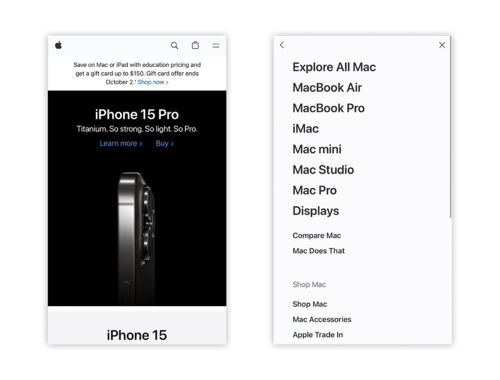
Apple is one of the leading companies when it comes to UX/UI design for mobile devices. Their website is minimalist yet easy to navigate due to its clear hierarchy and structure. The CTAs and buttons are clear and show what action will occur if the user clicks on them. Their menu is organized by product type and the specifics of the product chosen are shown through further visual hierarchy and organization.
Apple is a perfect example of how to use minimalist design without making the designs too simple or boring.
2) Warby Parker
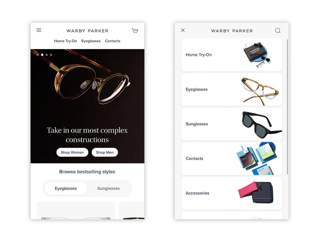
Warby Parker has a bold yet clean hero section that has a straightforward carousel design. Their products are also divided by category and the user can quickly switch through the different categories with just one click of a button. In their menu, they include thumbnail images to quickly convey what each category includes. The images are just the right size without being either too small to see or too large and distracting.
Warby Parker’s sleek and intuitive mobile web design creates a sense of reliability and elegance within their brand, which helps their customers feel confident in their products.
3) WIRED
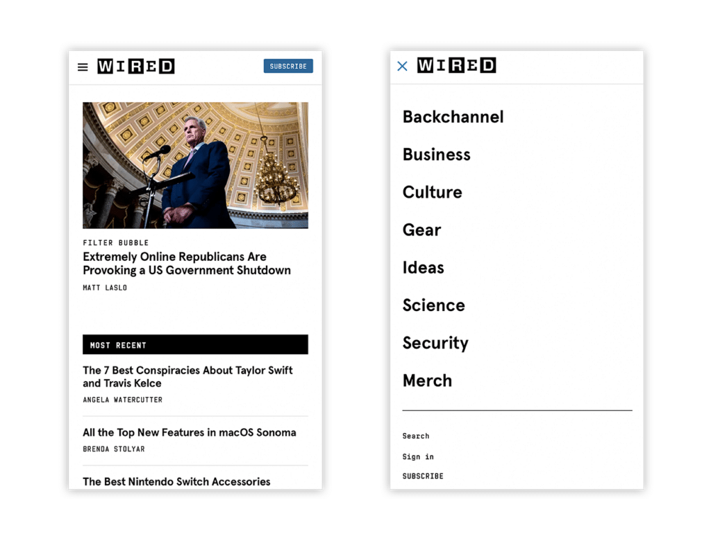
WIRED has a minimal black and white branding that uses block and line elements in their designs. They use this simple layout to their advantage for their mobile website to organize their content. Each type of news section is divided into lines and blocks, and the users are able to quickly discern the different types of topics they are delving into as they scroll through.
While boxy elements are very common in web design, WIRED’s website stands out from the rest because of their use of interesting graphics and an appealing organization of their content through the use of subtle design elements.
4) Slack
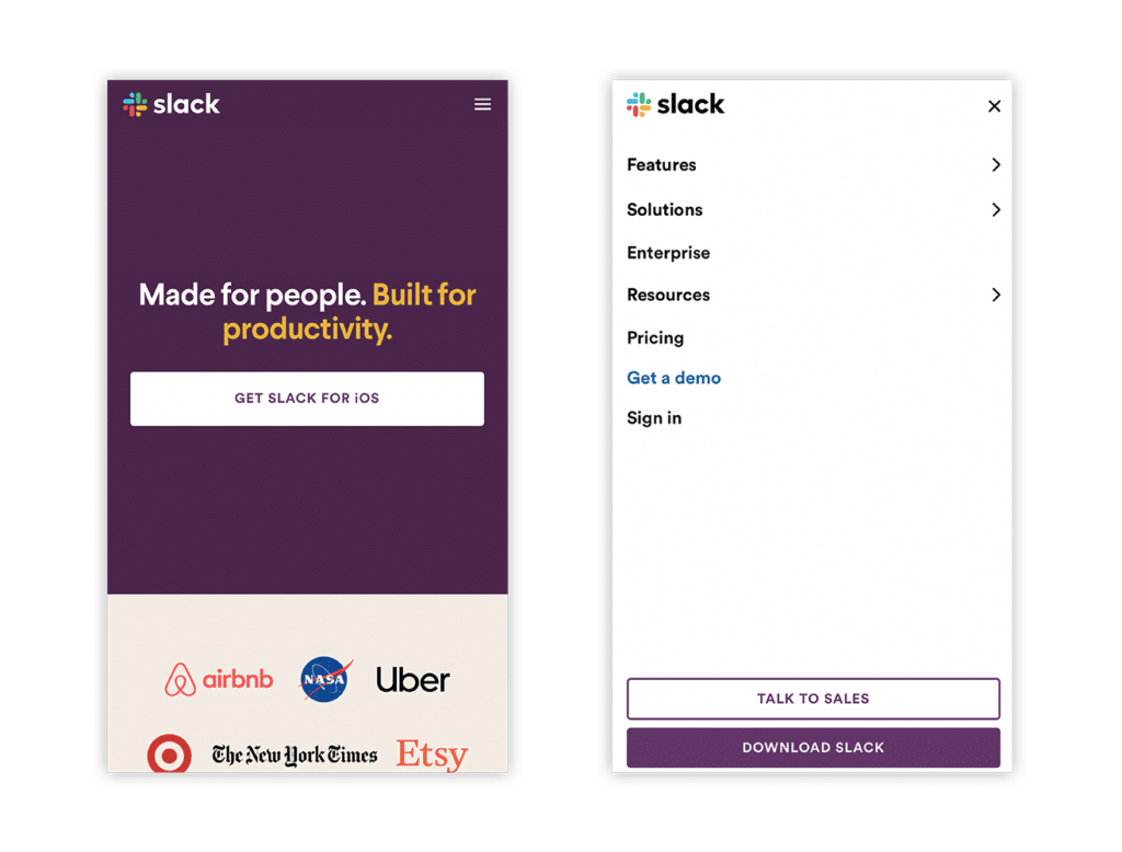
With clear, large, and eye-catching CTAs, Slack’s interface directs the users to their product and provides further information if interested. Even in their menu, they include clear CTAs to encourage users to check out their product without being overwhelming. Also, Slack features slightly different designs on the mobile and desktop layouts, to optimize for each unique experience.
As a whole, Slack has great branding, designs, and illustrations that are used in a smart way to communicate their services. They have gained their current brand recognition due to their successful branding strategy and design choices, which they have effectively applied to various platforms, including their mobile website.
5) Typeform
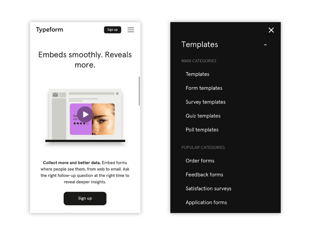
Typeform’s website has a lot of negative space which leaves room for them to clearly feature their services and product. The images and GIFs displayed are also optimized for mobile, with the GIFs playing smoothly. Their menu is minimalist and straightforward with a clear hierarchy. Also, their easy-to-use website reinforces that their products and services will be just as intuitive to use.
Typeform is a perfect blend of modern and minimalist web designs that have appealing designs but can still effectively communicate their services without compromising accessibility and user experience.
Need help with designing a mobile-friendly website? Don’t hesitate to reach out to us.