The Anatomy of a Great 404 Page

We’ve all been there. You click a link expecting to find one thing, only to land on a page telling you it doesn’t exist.
While a 404 page usually indicates something has gone wrong, that doesn’t mean the experience itself has to be frustrating for users.
Broken links, deleted pages, and mistyped URLs can all contribute to landing on a 404 page. A well designed one can turn that into an opportunity to keep visitors engaged with your website, and maybe even make for a memorable brand moment.
So, what makes a great 404 page? Let’s break it down.
Start With a Clear Message
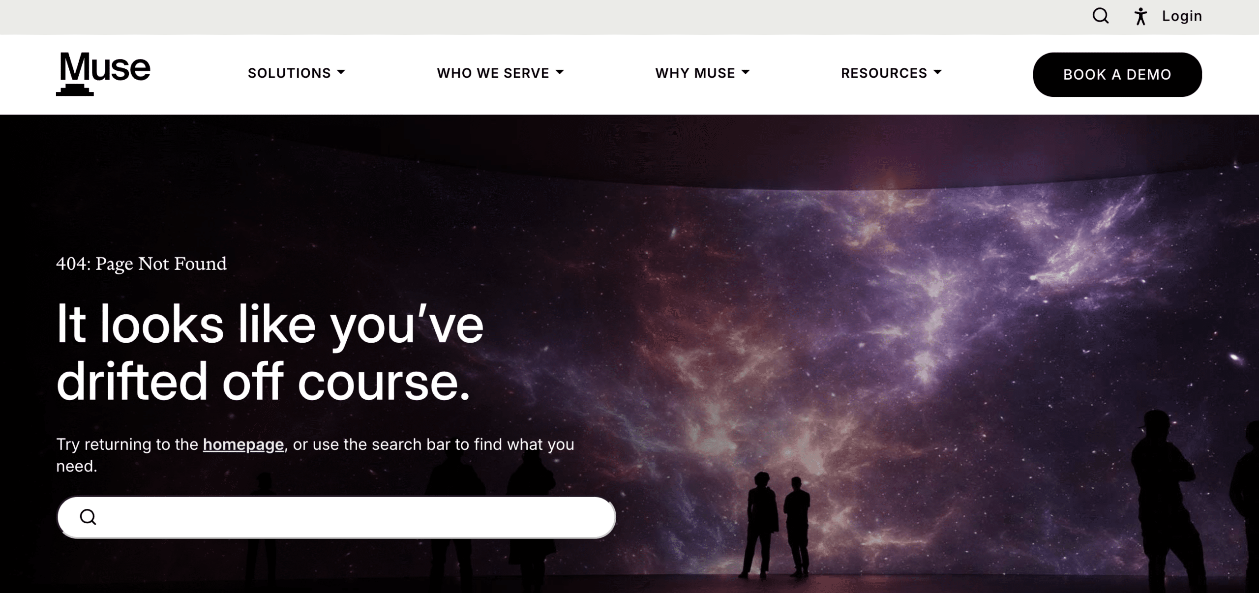
musesoftware.ai/404
First things first, tell people what happened.
Simply saying “404 Error” may be common knowledge for a developer or marketer, but not every visitor will know what it means. Use clear, simple language to explain that the page they were looking for can’t be found.
Something as simple as “Oops! We can’t find that page” immediately lets visitors know what happened without confusing them.
Provide a Way Forward

houstonjewish.org/404
A 404 page shouldn’t be a dead end. Once you’ve told visitors the page doesn’t exist, you should help them figure out where to go next.
At a minimum, provide a quick link back to your homepage. You could also include a search bar or links to other key pages or popular resources to help send users back into your site. Think about what users will most likely be looking for once they come to your site.
The goal is to make it easier to continue exploring and prevent users from getting frustrated and leaving your site altogether.
Prioritize Brand Consistency
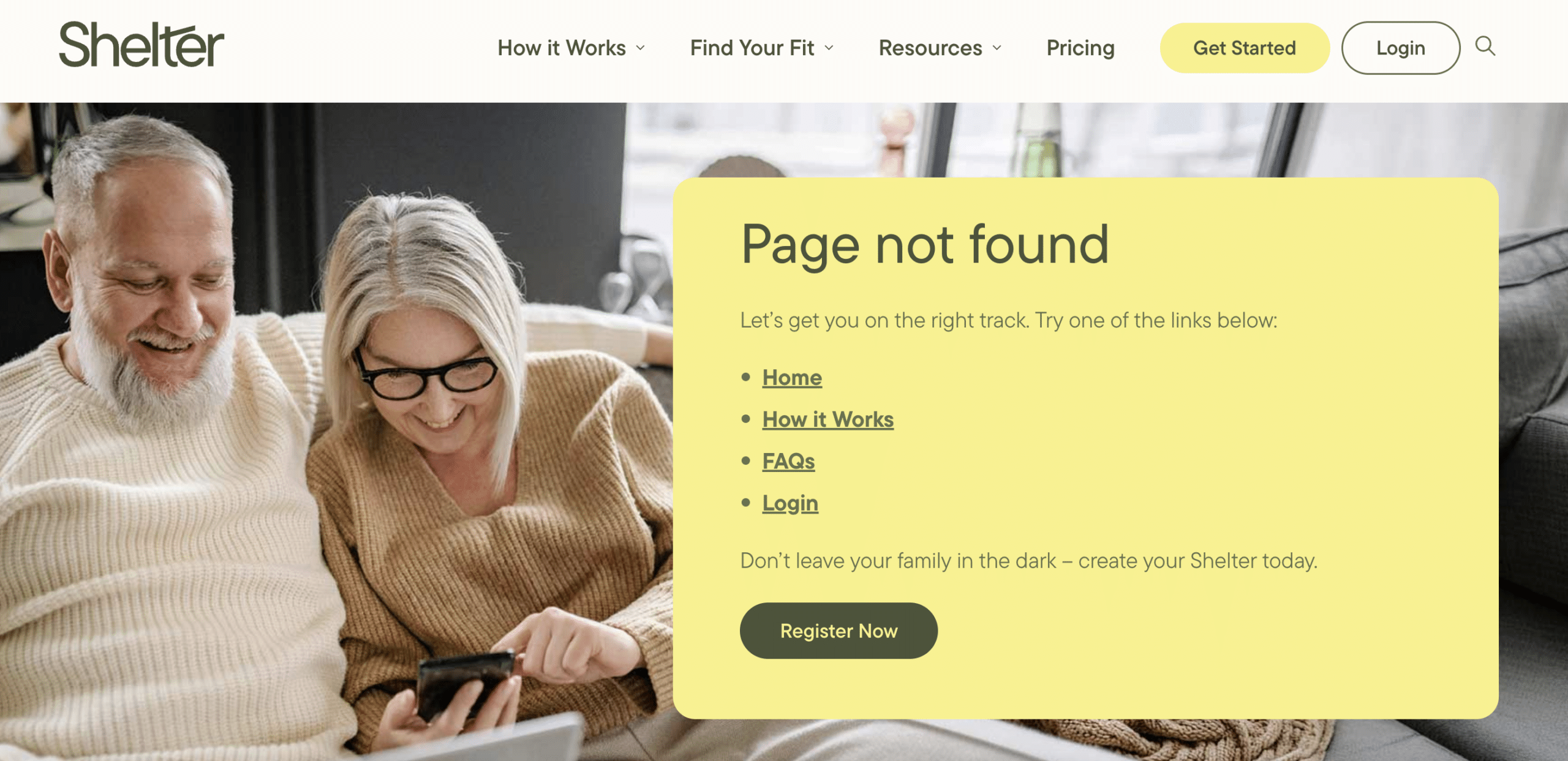
getshelter.co/404
Your 404 page is still part of your website, so it should look and feel like it.
Be sure to use the same colors, typography, imagery, and overall visual style visitors see throughout the rest of your site. A generic error page can hurt your brand or make users wonder if they’ve ended up somewhere else by mistake.
Maintaining your brand creates a more seamless experience, even when the visitor lands somewhere unexpected.
Add a Little Personality
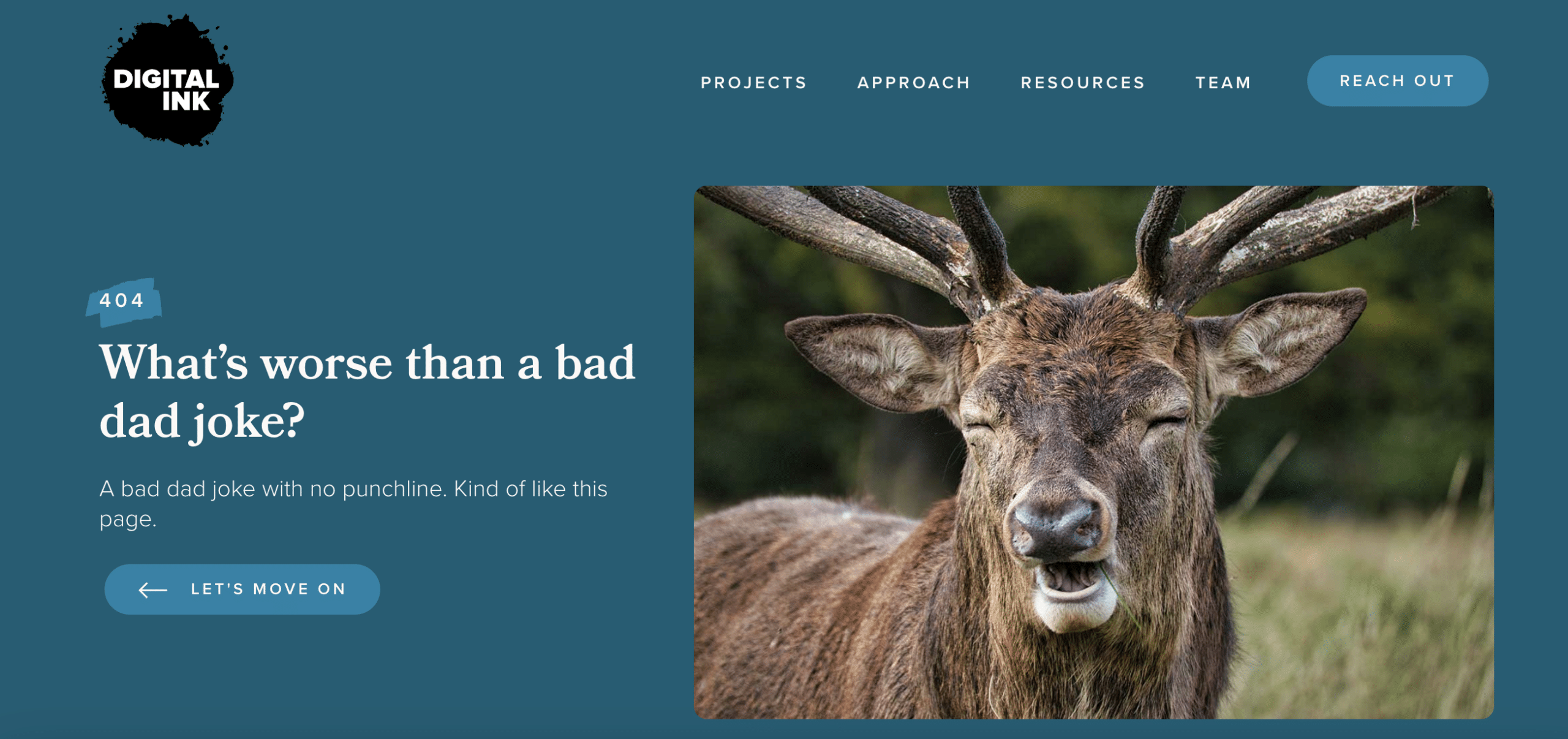
digital.ink/404
404 pages can actually be fun.
Because visitors already know something went wrong, a little clever humor or creativity can turn a potentially frustrating moment into a memorable brand interaction. Try clever copy, a fun animation, or some other unexpected detail that fits your brand’s personality.
Nobody visits your website hoping to find a 404 page. But when they do, thoughtful design can keep a small error from becoming a reason to leave.
If you want some more inspiration for your 404 page, check out these legendary examples!
Need help creating a better experience across every page of your website (even the unexpected ones)? Reach out to us – we’re here to help!